Continued from yesterday.
Let’s take another look at what we’ve been doing here. Because the “value” of a layer is a single number, you don’t actually have to make the layer gray-scale in order to use it like we have been doing.
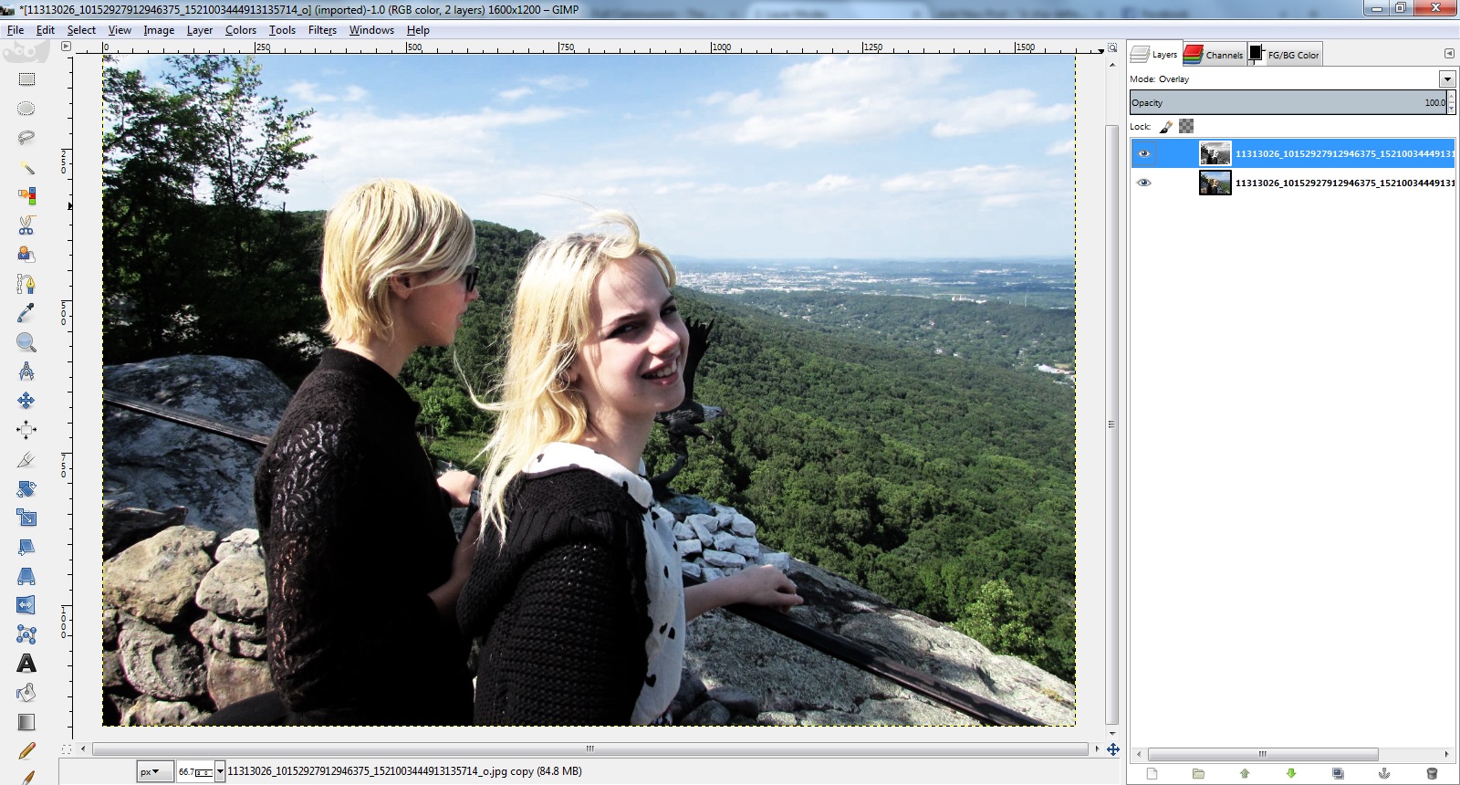
As before, I duplicate the layer, and this time I set the top layer’s mode to “value” without using any channel mixer first.
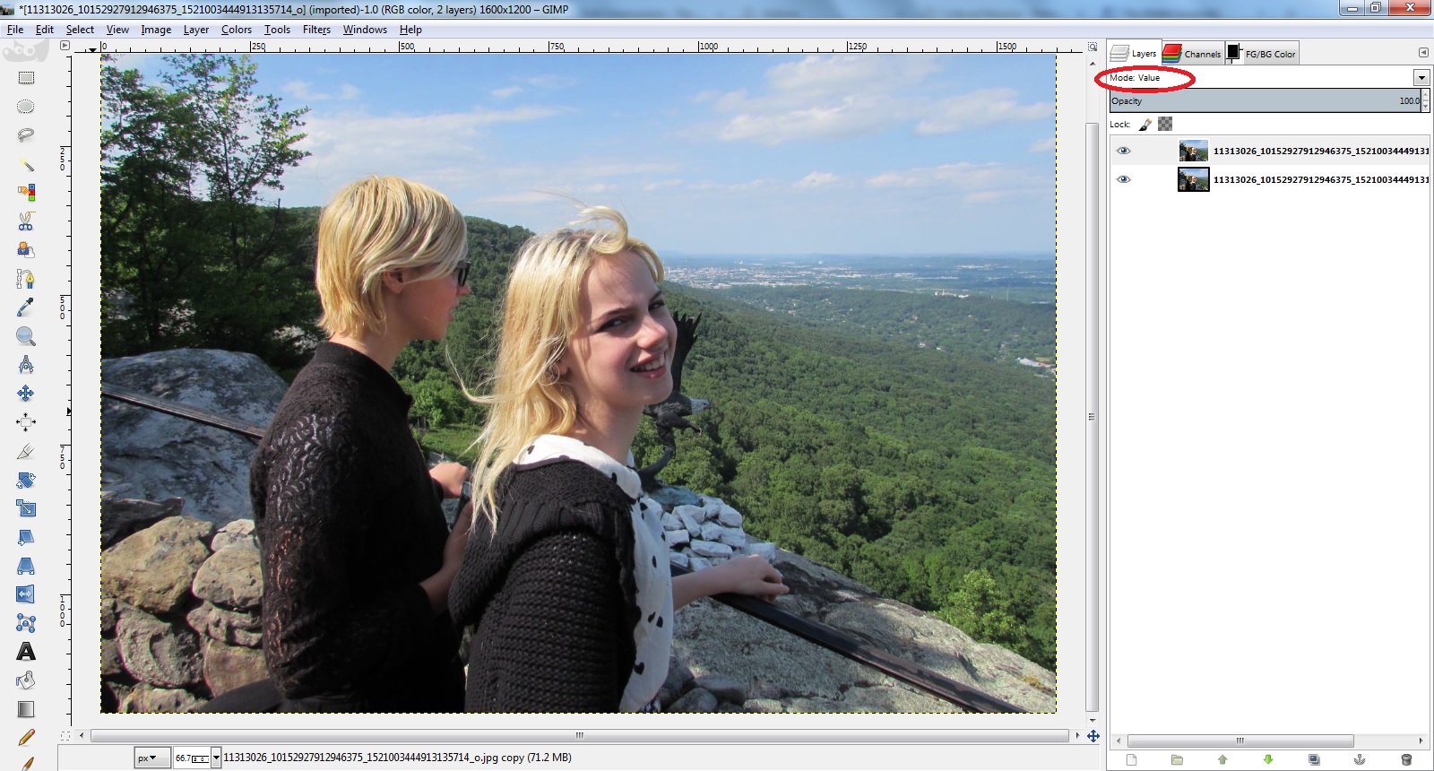
Now, initially it is not having any effect on the layer below it, since it is an identical copy it has the same value for all pixels.
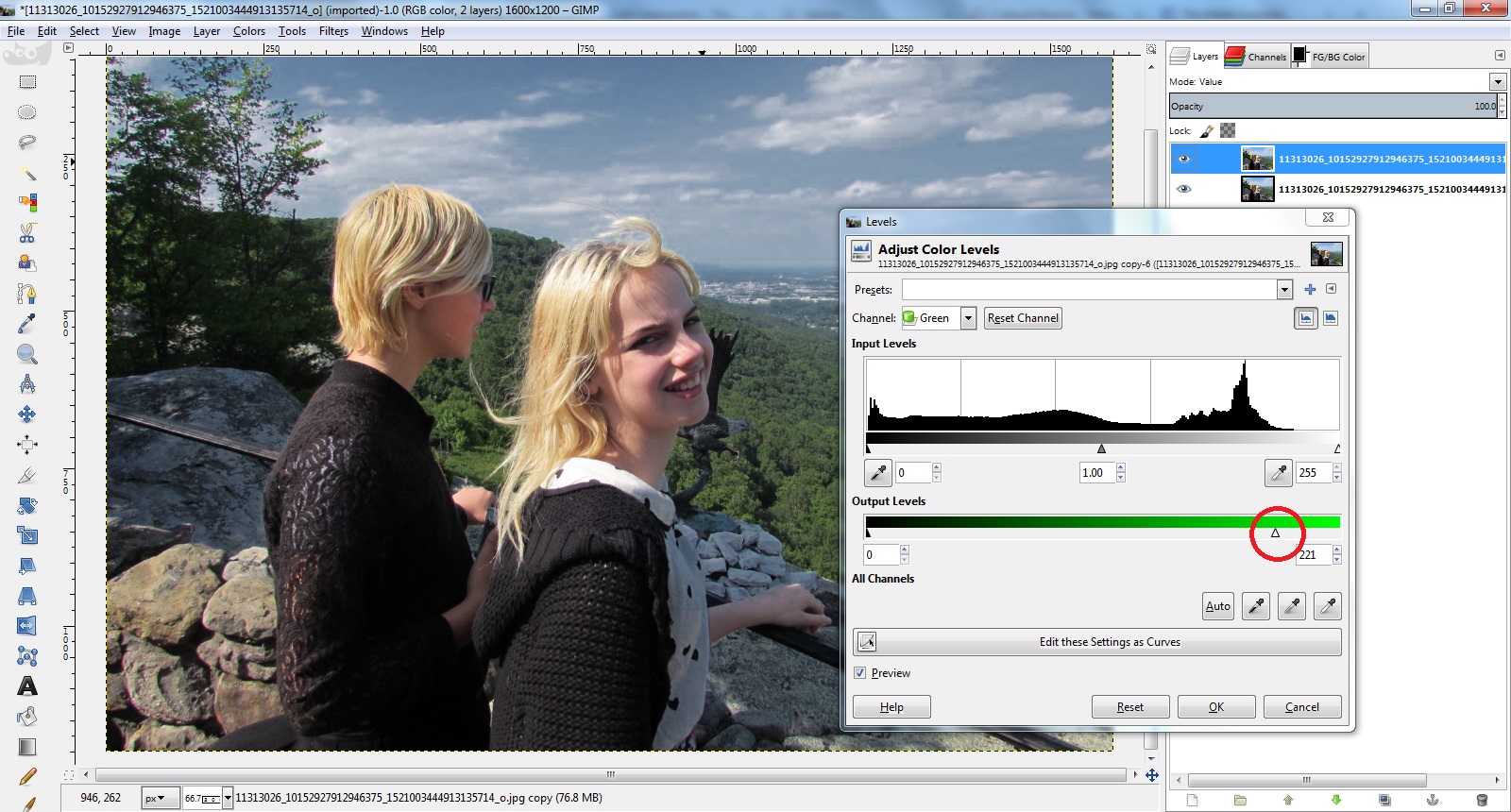
Now we are going to use Levels to get us back to where we were with the channel mixer, only because Levels previews the changes in real time, we will be able to see what the overall effect will be while we are monkeying with the sliders.
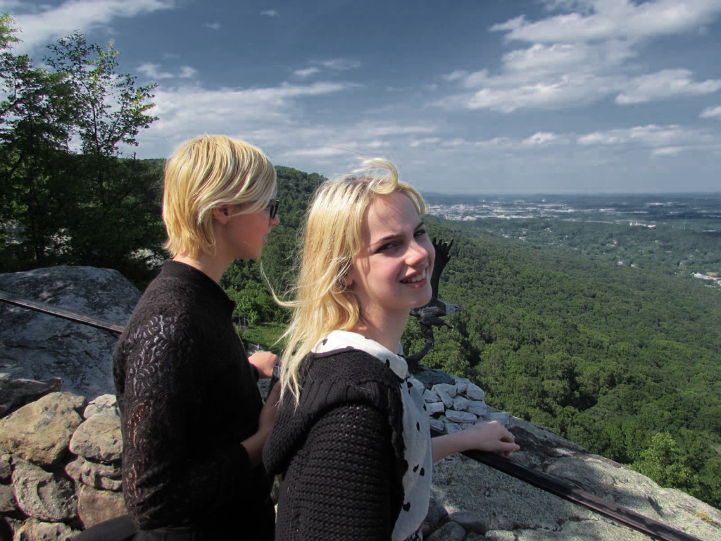
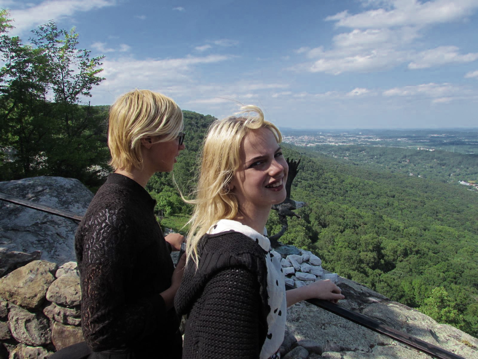
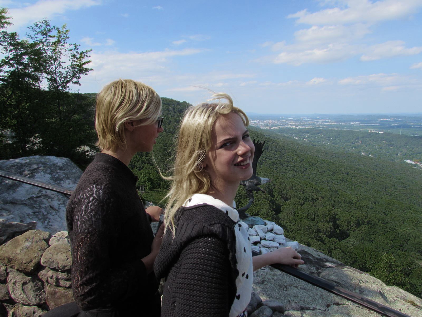
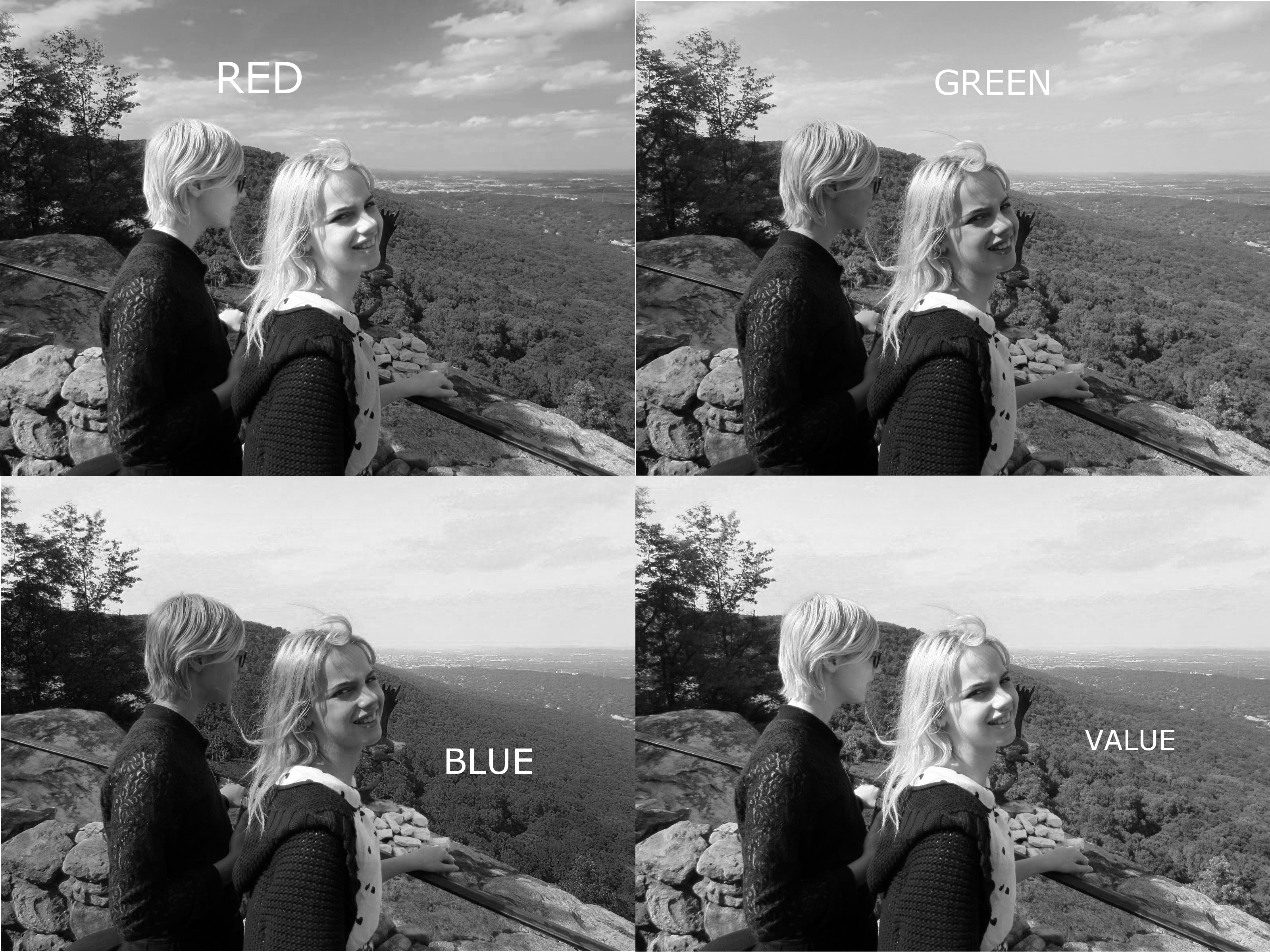
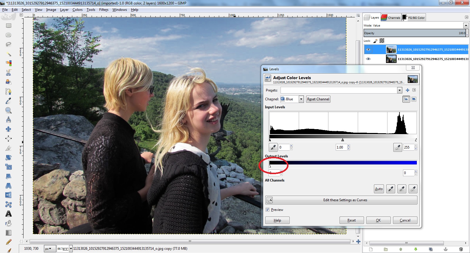
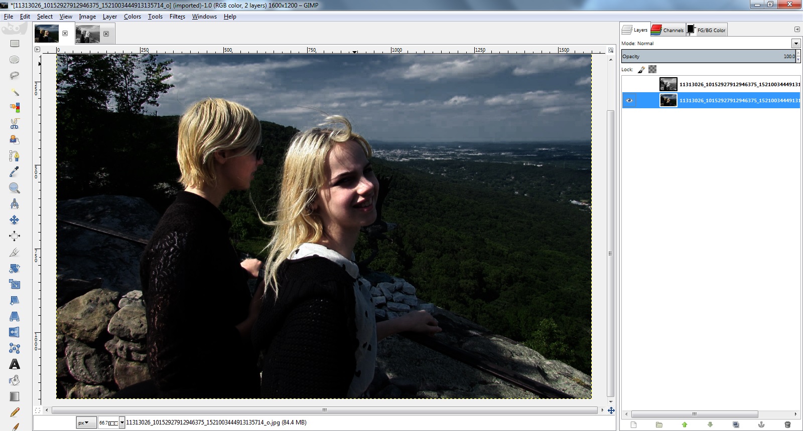
Choose the Blue channel and drag the output slider halfway down. Notice the sky gets darker. This is because blue is not contributing less to the channel’s overall value.

Go on and drag it all the way down to zero, completely suppressing any contribution that blue might have been making to the value.
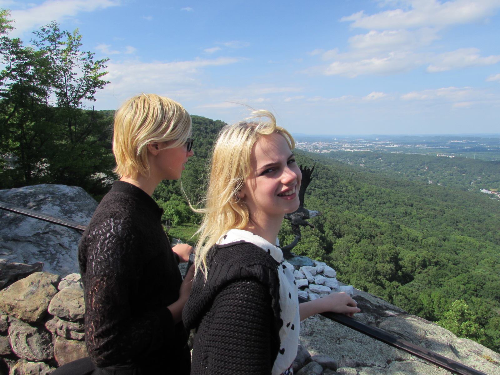
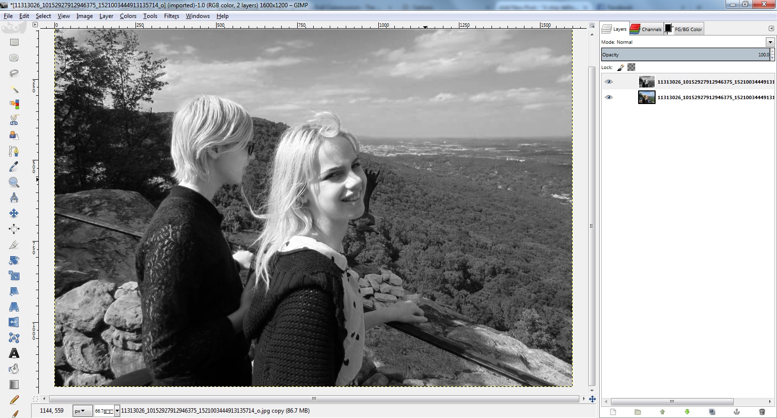
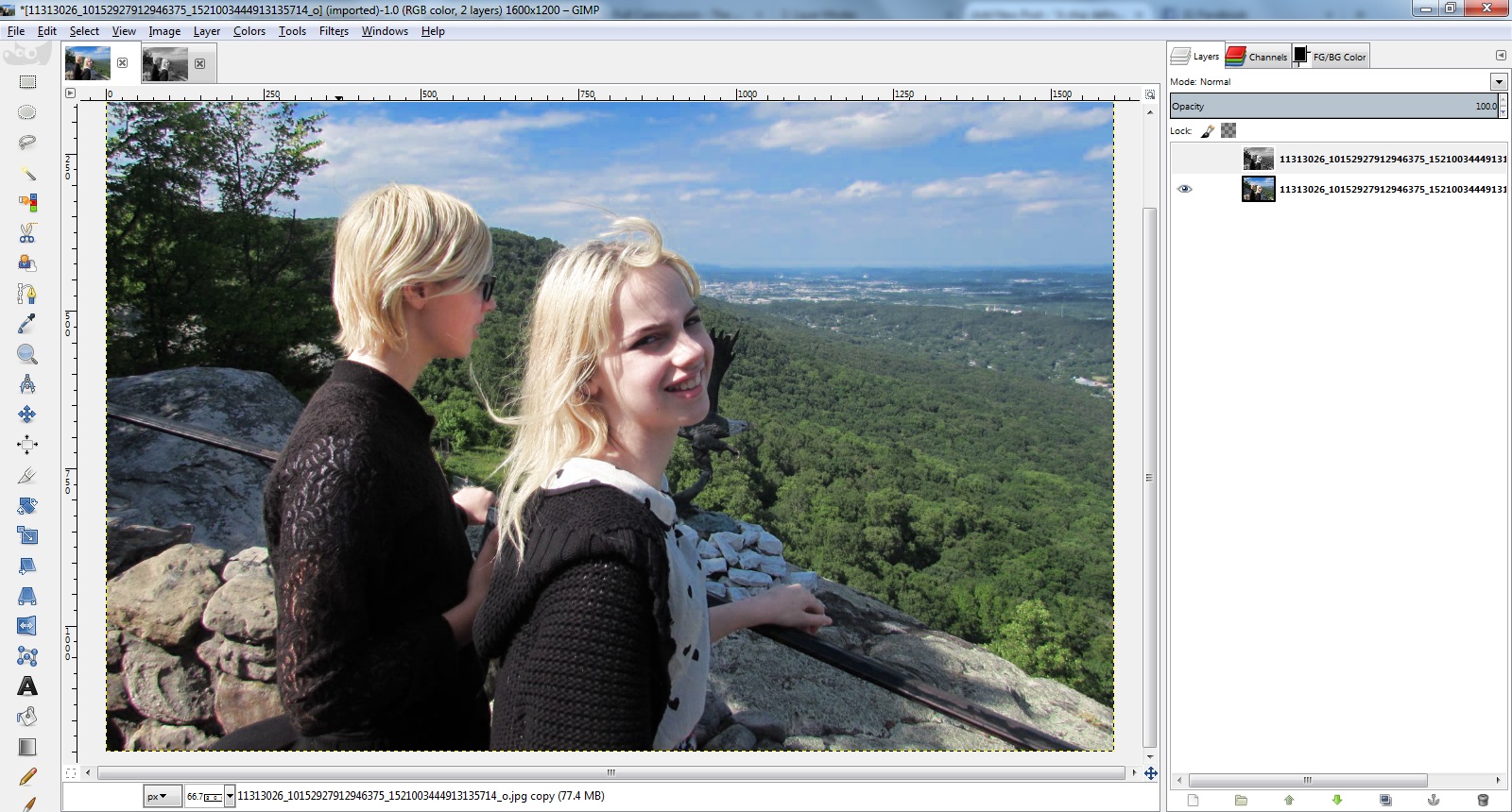
By the way, at this point if we view our top later as “normal” it looks like this:
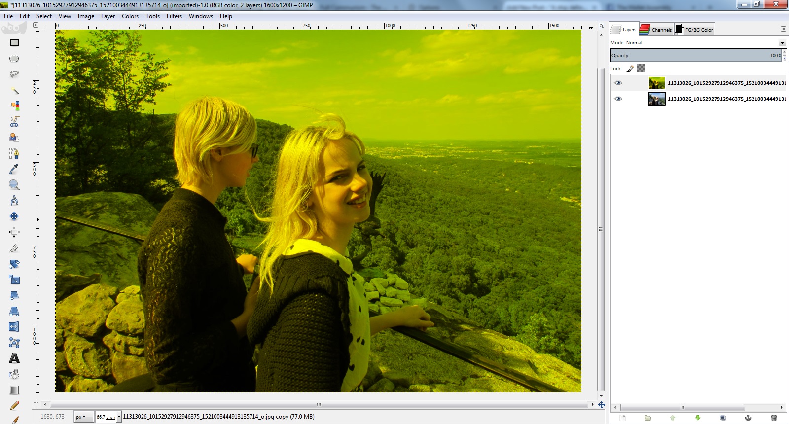
The actual layer has red and green but no blue, giving it a yellow hue. But the fact that only its value is affecting the layer below it means we never see this yellow. But I digress.
Notice anything odd about what happened to the blended layers when we went from halfway to no blue at all?
What didn’t happen? The sky didn’t get any darker. It was already as dark with the slider halfway, as it was ever going to get.
Now think about how “value” is calculated. Value is the maximum of R, G, and B. So it a pixel has R=255, G=128, and B=80, it’s Value is 255. The smaller numbers play no role.
So what happened to the sky is, as soon as we had turned down the blue enough that it was no longer the largest of the three numbers, it no longer made any contribution to the value, it became irrelevant. The value of those pixels that used to be mostly blue is now determined solely by their red and green channel, even if there is still almost as much blue left.
If we then go mess with the green, we see the same thing, we only have to turn it down about 1/4 of the way before it stops contributing to the value.
This is just inherently how the HSV color space works. HSV was invented in the 1970s and intended to be used on the primitive computer hardware of the era, so the calculations to convert between it and RGB had to be as simple as possible.
It is, as noted last time, precisely this property that allows those pink faces in the picture to remain more or less as-is. The brightest channel for all of those pixels is already red in the original image, so their green and blue make no contribution to the value, and therefore those pixels do not change value when the overall amount of green and blue is reduced. That effect actually seems kind of beneficial when deal with people.
But what if we don’t like the limited amount of effect that our adjustments have? There are other ways of measuring the brightness of a pixel which take more than one RGB channel into account. Examples would be Lightness and Luminosity.
But GIMP does not give us layer blend modes for Lightness or Luminosity, only Value, so that trick isn’t going to cut it.
There are other modes that can allow a layer to affect the brightness of the layer below it, but we won’t be able to play our little slider games. If we try it with a color layer on top, the hue will be affected.. in the particular extreme case of turning down everything but the red channel, we’ll end up making our final blend be all red. We’ll have to convert to gray to start with, like in the original installment.
(If only GIMP supported non-destructive effects, this would all be moot)
So first start over with an exact duplicate of the base layer, and use the channel mixer to get a monochrome image of 100% red, 0% green, 0% blue.
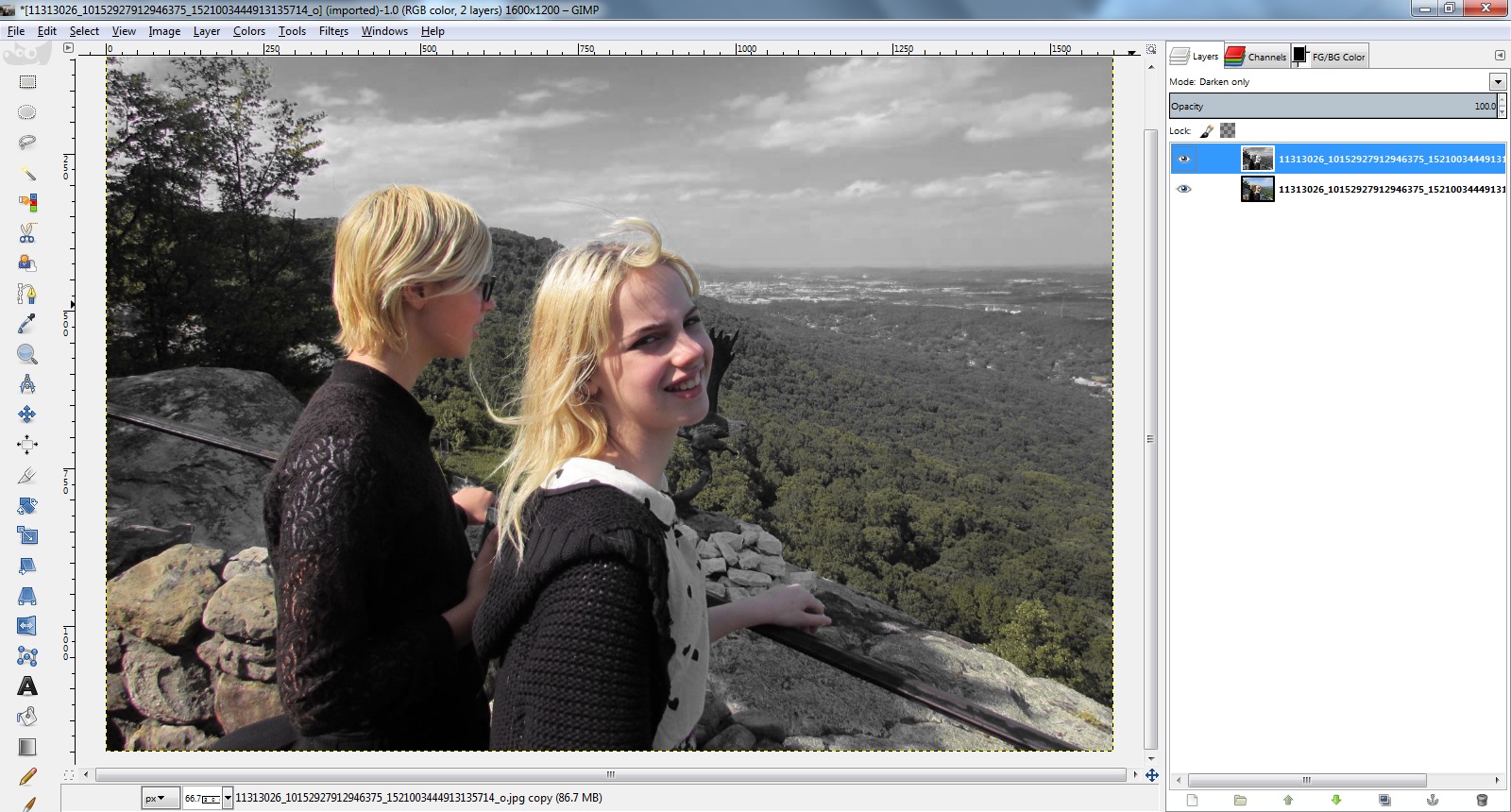
The first one I want to point out is Darken Only. The way this works is, it compares the all three channels of both layers, and chooses the darker of the two values every time. What this means is, areas that are dark in the monochrome layer, like the sky, and up monochrome in the final blend while areas that were bright like the faces in the monochrome end up using the color of the orignial.
That is, the sky is completely desaturated as well as darkened, the trees partially so, and subjects mostly untouched! That’s kinda neat, I guess.
Now lets look at Multiply. As the name implies, this multplies the values of the two layers, scaled down so that brightness can not blow out the highlights. This darkens everything, but especially the blue and green areas, and also mutes the colors but not as drastically as Darken Only.
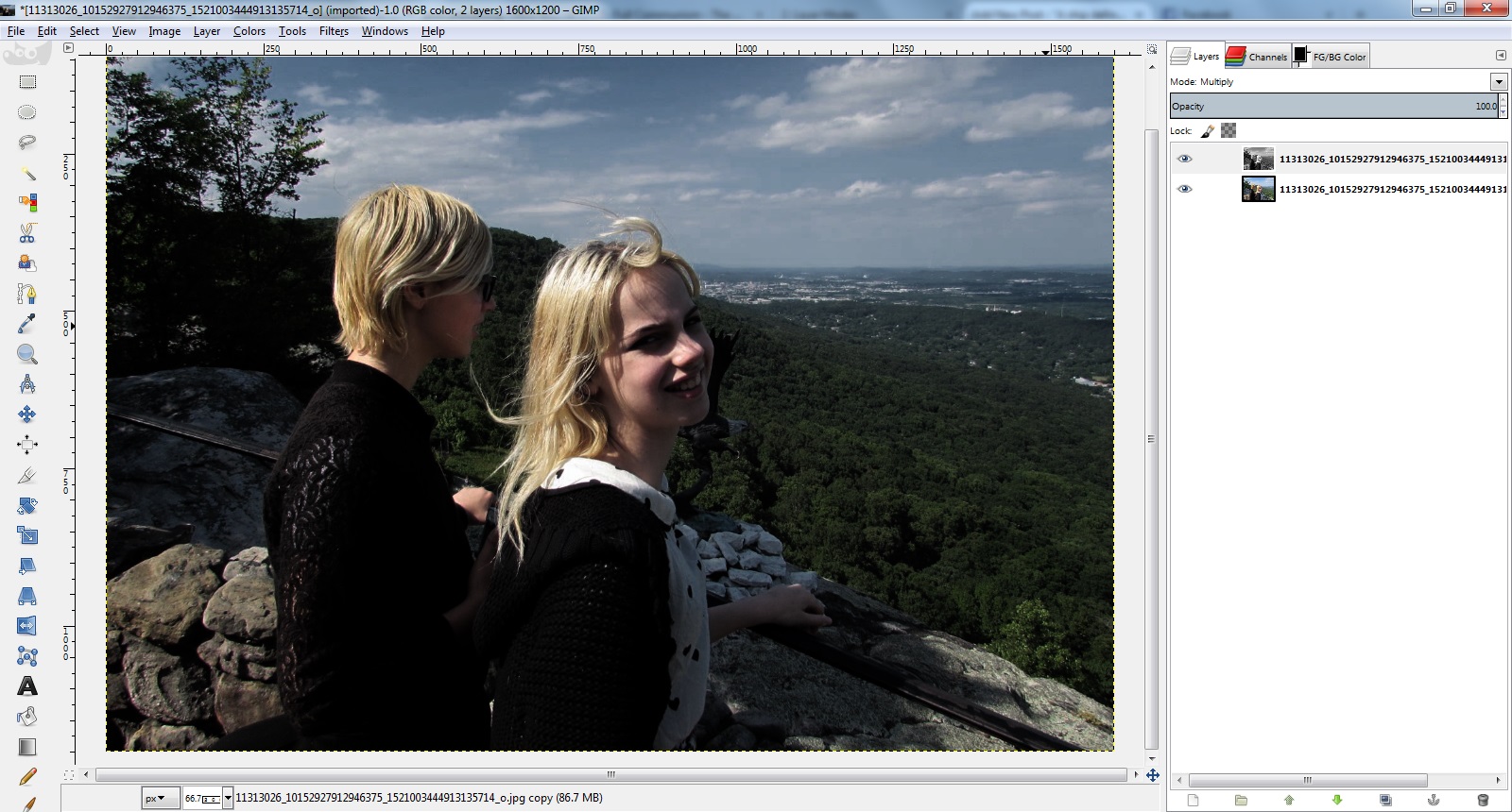
You can mess with levels and curves to try to re-brighten it, but the more you do so you will be undoing the darkening of the sky as well.
Overlay is normally supposed to darken an image, but in this case it actually makes it a lot brighter in the areas that have a lot of red. I don’t really feel like trying to understand why.
There are a lot of other modes but they are all really ugly and are left as an exercise for the reader.
Now, we still have at least one more trick up our sleeve. We can use the decompose/recompose workflow to substitute this red channel in for one of the various types of “brightness” channels that exist several of the color models other than RGB.
So, turn off the visibility of the monochrome layer and select the base, original colored layer, and go Colors->Components->Decompose. Look at all those color models to choose from.
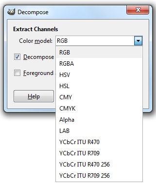
Obviously skip RGB and RGBA, we already used channel mixer to accomplish anything we could use that for. Also skip HSV since it is equivalent to what we were doing in the first place.
Let’s try HSL (Hue, Saturation, Lightness), another 1970s era color model for crappy hardware with simple math.
This creates a new image with layers for each of Hue, Saturation, and Lightness. Hide the first two and look at the Lightness channel. It is a greyscale representation of the original image.
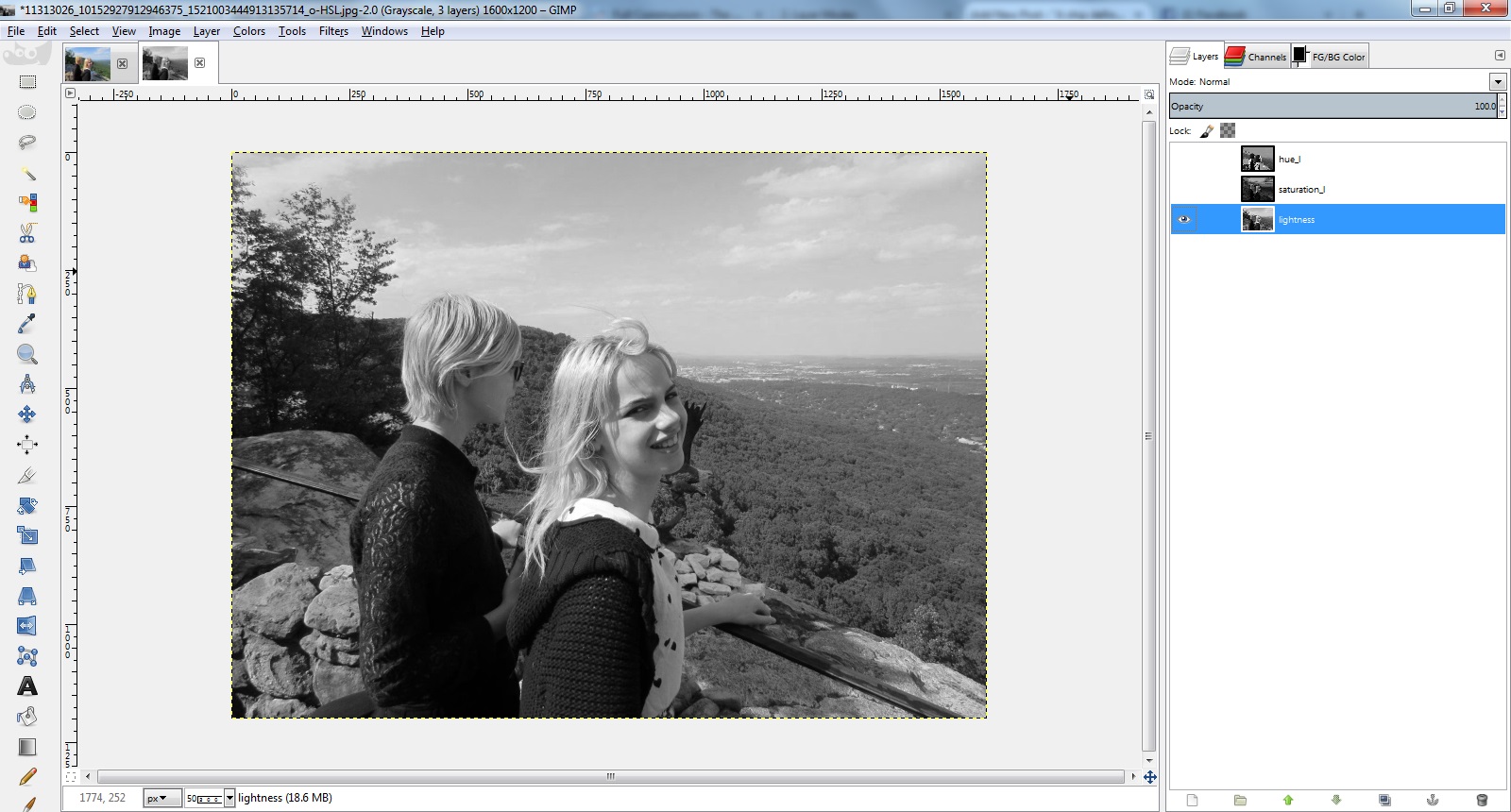
Now, what I’m going to do is copy the layer that we originally made using channel mixer, and paste it onto the Lightness layer of the decomposition, completely replacing the contents. I’m going to assume you know how to copy and paste layers in GIMP.
The difference is subtle in the monochrome, but the pasted contents are slightly more “contrasty” than what was there before.
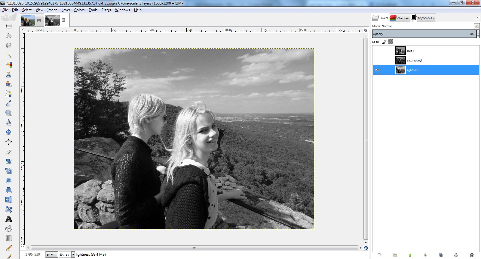
Now, go to Colors->Components->Recompose, to reassemble these layers back into a color layer. GIMP remembers which layer they were extracted from and puts the new image back on the same layer in the original image.
The result, the contrast has been boosted without affecting the saturation like some of the other approaches (that is, the sky is a deeper blue not a dull blue-gray). It is certainly a less dramatic effect that some of the other stuff we’ve been doing though.
Other color models choices should have varying degrees of difference. I don’t feel like looking at them all.
LAB ends up darkening things quite a bit, almost but not quite as much as the Multiply mode did:
CMYK with our monochrome image pasted over the blacK channel and inverted ends up being exactly the same as the Value mode we started with. I guess that means that the K channel is really just the inverse of the V channel from HSV. Huh.
That’s probably about as much as I feel like messing with this for right now.