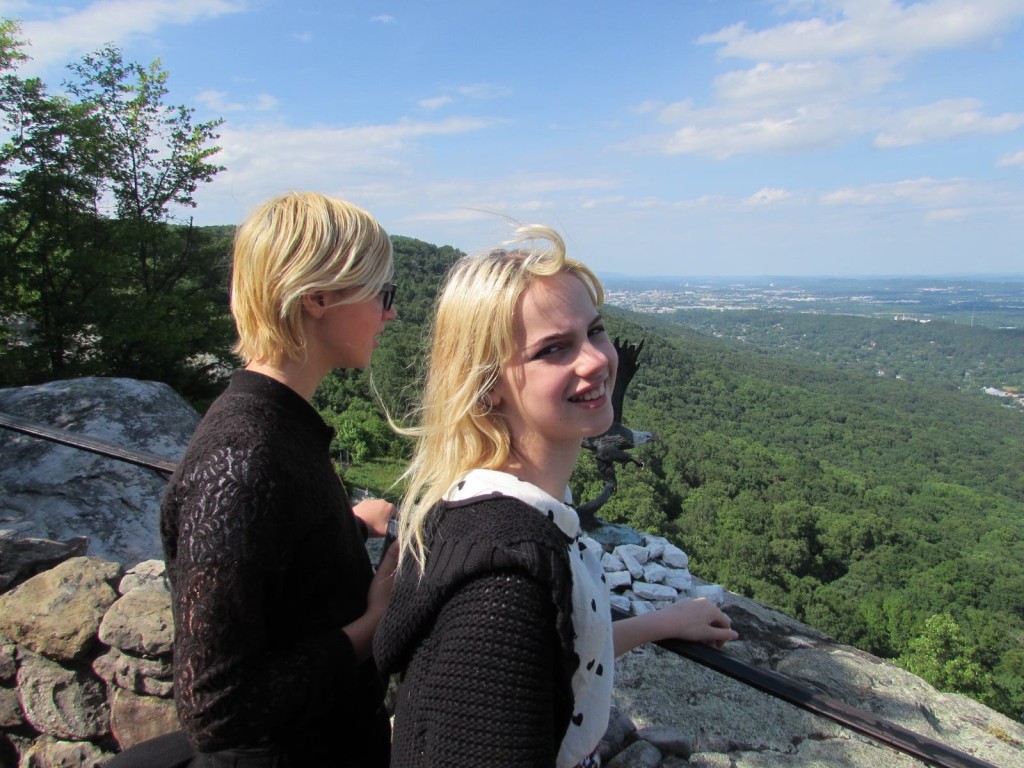
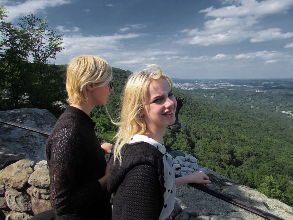
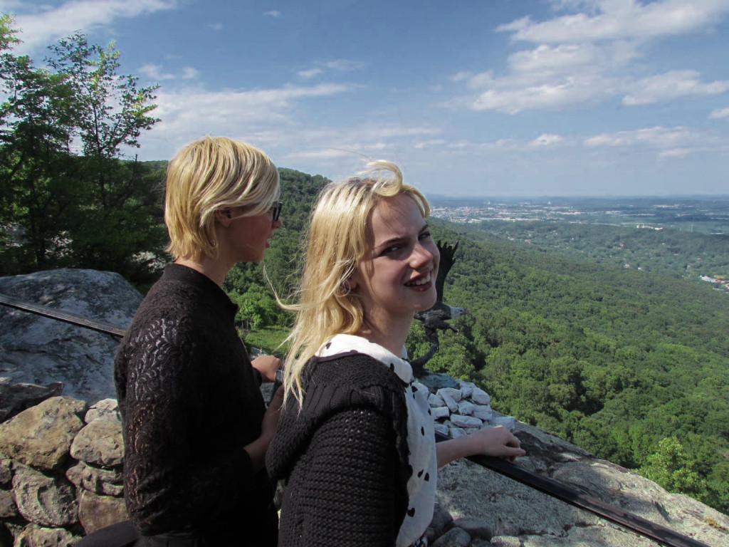
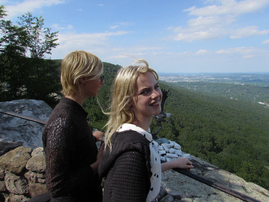
Remember last time, I said that I wasn’t sure what would happen if I tried that particular layering process on a portrait. Well, I tried it, and I was pretty surprised by the result at first, and then realized it wasn’t so surprising after all.
Since the actual technique – create a black and white image of one channel, and then apply it as the value for all channels – was covered last time, I’ll skip the GIMP screenshots and jump straight to results. These examples also use the red channel, as before.
Mind you, I’m not claiming this is a great photo, but it has the advantage of being (a) my own work and (b) has a blue sky in the background.
Now see the before and after:
Notice anything about the subjects? They hardly changed at all, compared to the background. It looks almost as if you separated the humans onto an isolated layer before you messed with the colors of the background layer.
If you are wondering what the blue and green channels do, they notably do not share the red channel’s property of preserving the faces unchanged. Here’s the green version:
This preserves the brightness of the foliage, and probably you could brighten it overall and get the faces back close to the original but the trees extra bright.
The blue, I don’t see much use for but here it is anyway:
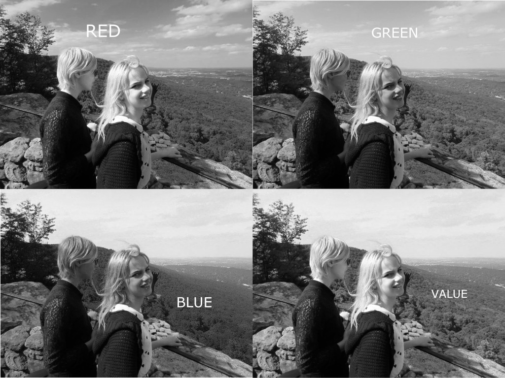
Now, why is none of this surprising in hindsight? Because these subjects have more or less pink skin, and the tones of their mostly yellow hair is also captured by the red channel. Their clothing is of course monochrome, so its going to be the same on every channel.This can be seen using the Colors->Decompose tool. This is all three channels of a RGB decomposition and also the V channel of an HSV.
Notice the red channel looks most like the V in the faces, the green looks more like it in the trees, and the blue has a similar (nearly white) sky. This is because the V(alue) channel in HSV is defined as the maximum of the R, G, and B values. No shit, Sherlock!
By the way, if the intention was to make a black and white version that looked good, I would probably not use any of the above as-is. The Desaturate tools’s Luminosity looks better than any of these, and I think 50/50 mix of the red and green channels (which is presumably close to panchromatic B&W film with a yellow filter) looks even better.
Now, the really interesting thing is, I’ve tried this on pictures of people with varying skin tones, and it does pretty much the same thing to everybody.
