Bayou La Batre and Coden

This is the first time I’ve posted anything of my hometown on this blog since I restarted it on WordPress.

On a recent visit “home”, I went around Instagramming not the usual sights of the town (that is, boats and the water) but other aspects.
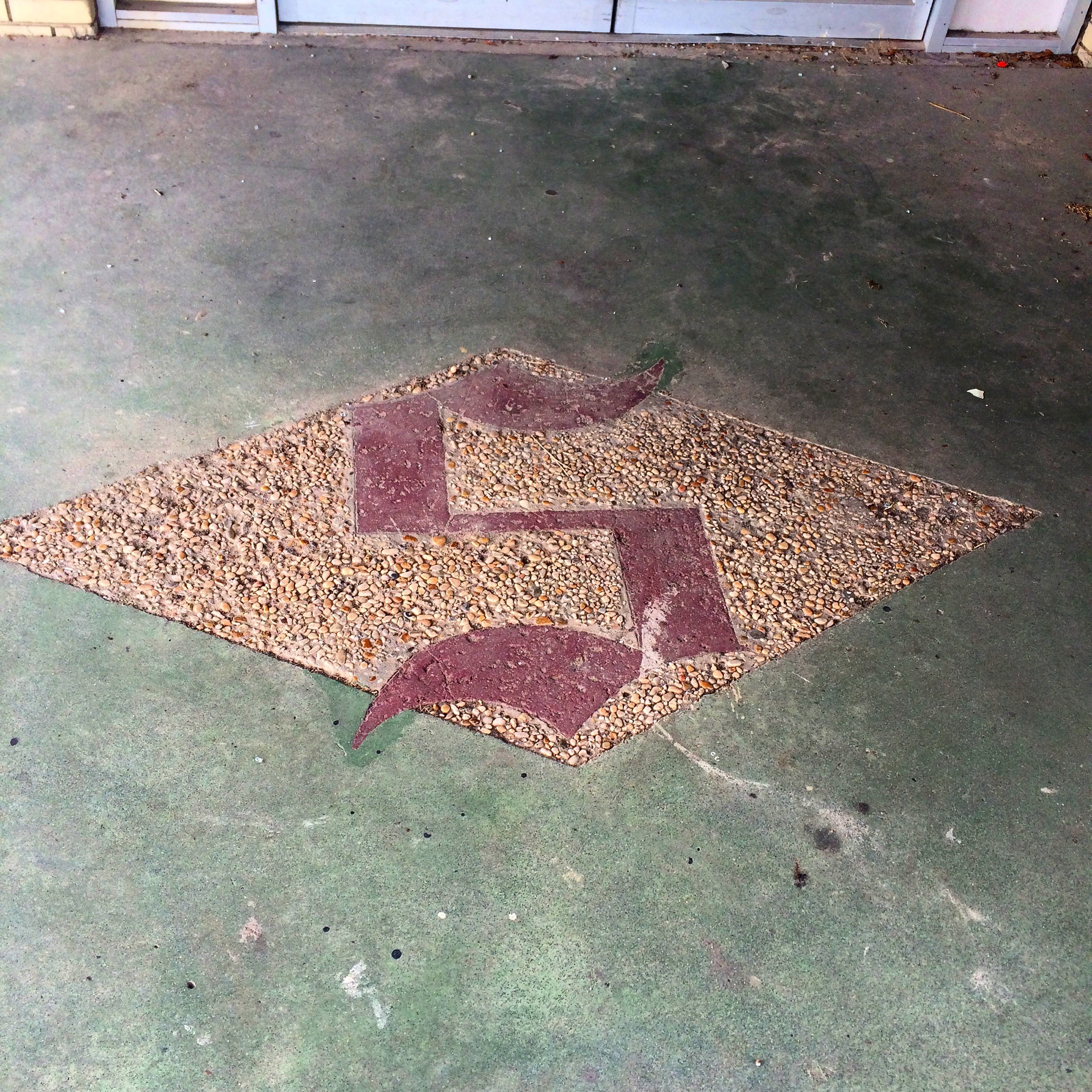
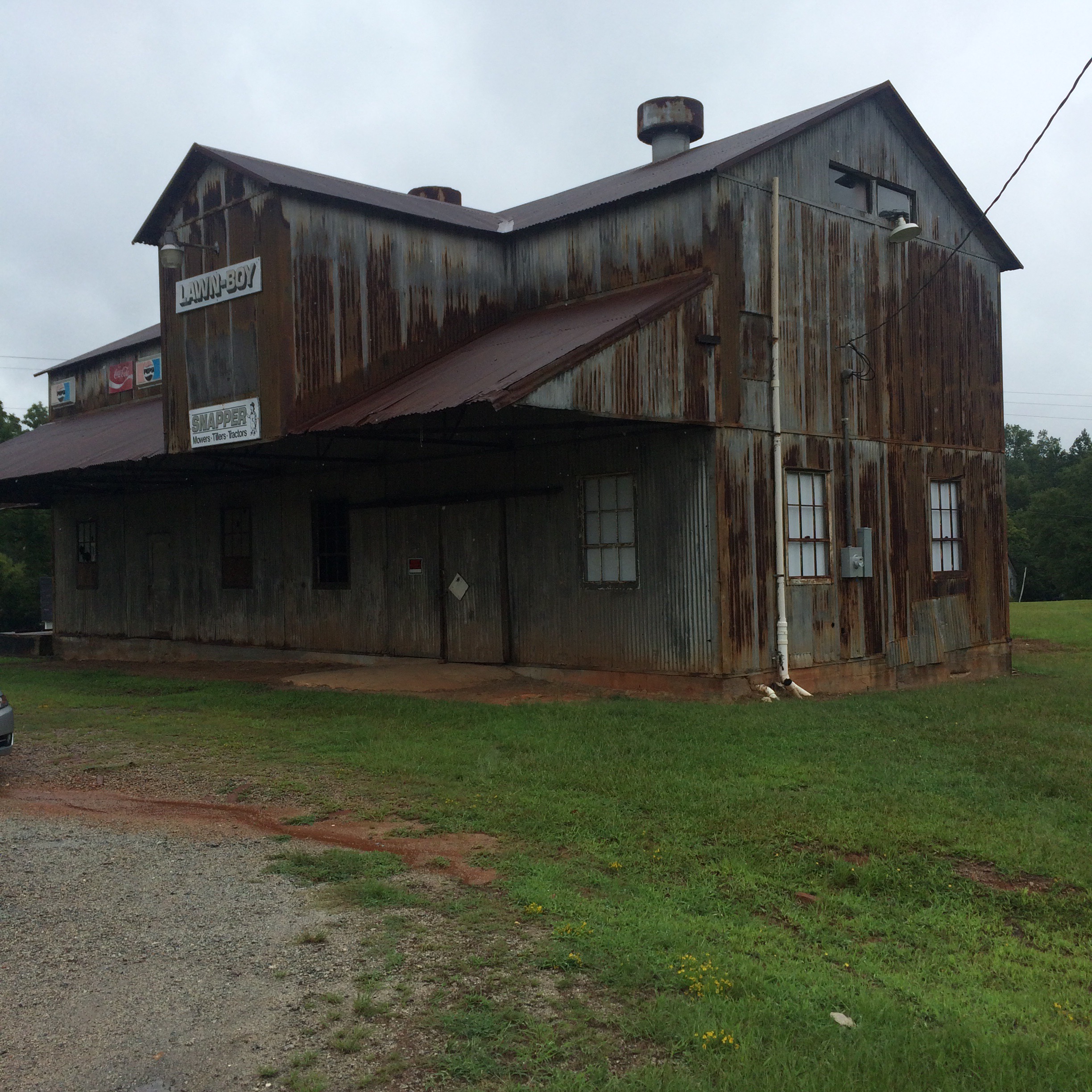
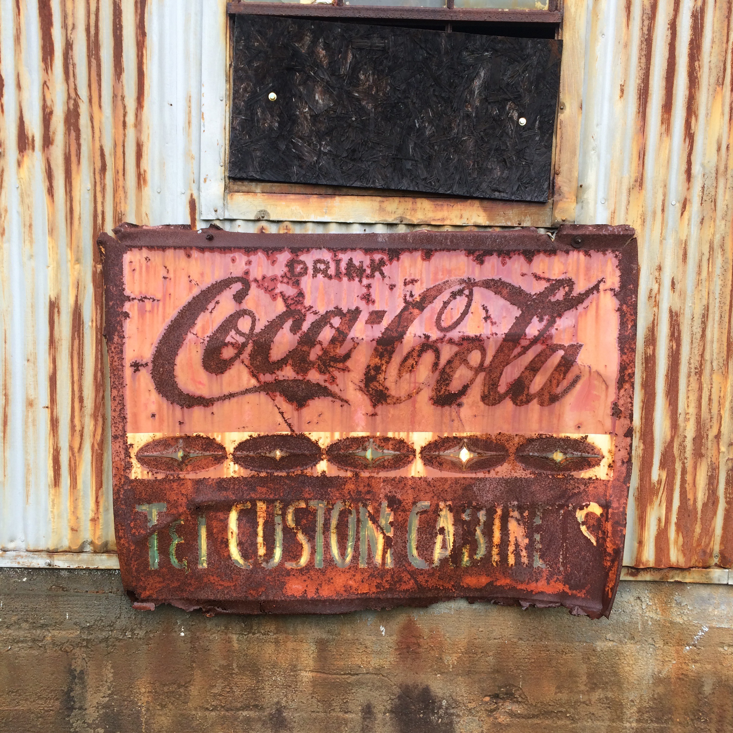
Schambeau’s

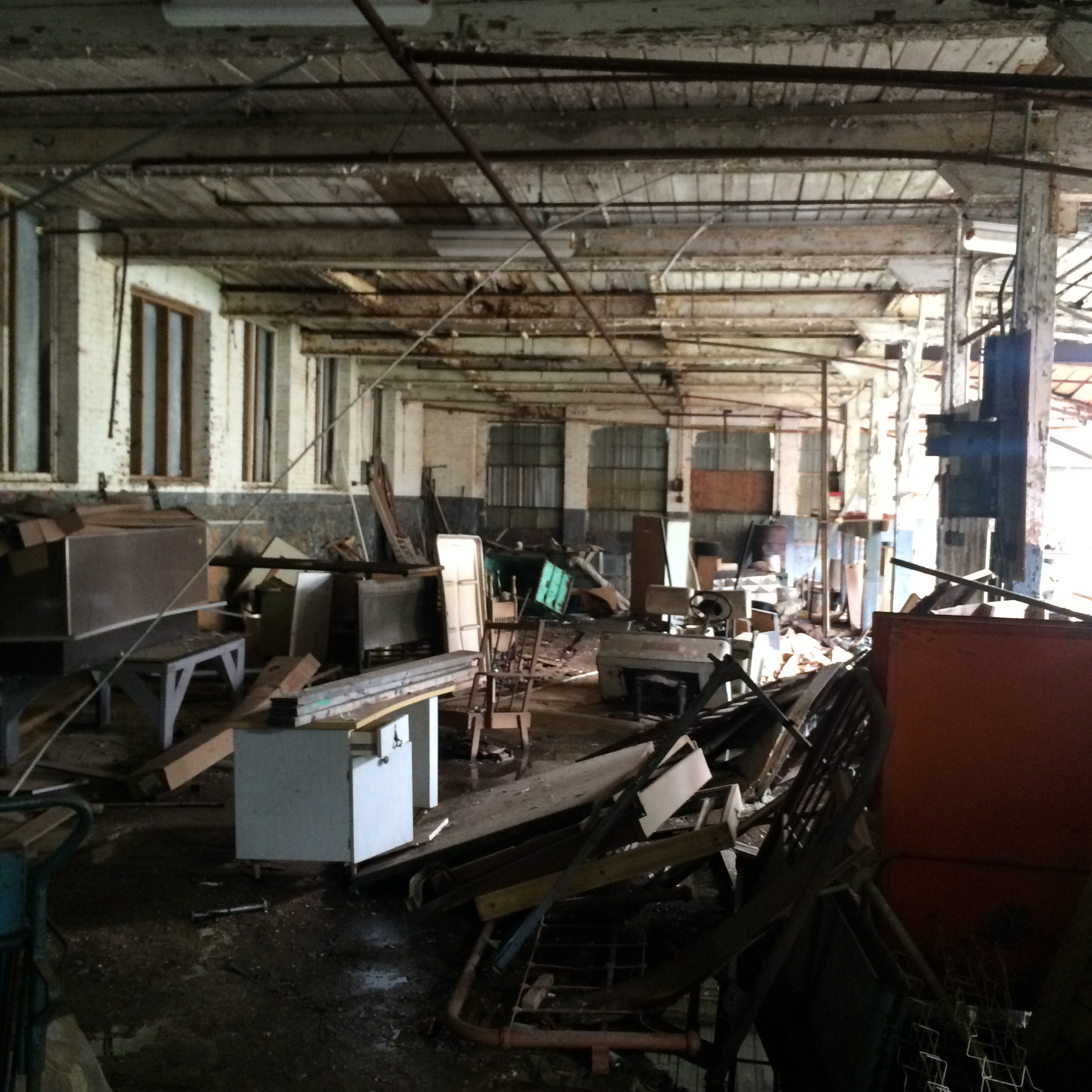
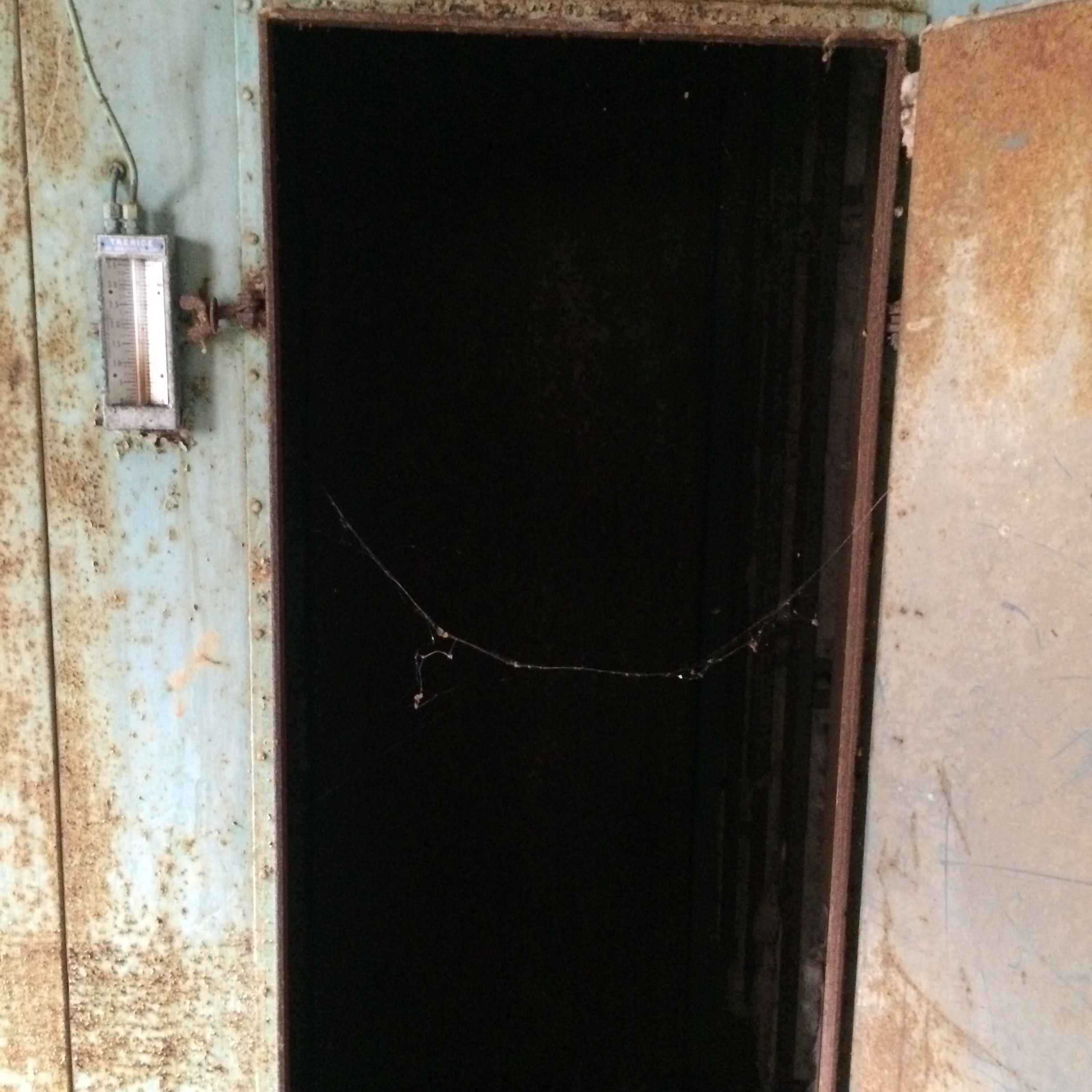
“S” logo on the sidewalk in front of the old Schambeau’s store. Schambeau’s, or Crum’s as the old folks called it (the propreitor was A. C. “Crum” Schambeau) was one of the most important businesses in town. They sold groceries, hardware, lumber, paint, you name it.

IMG_7854.JPG
Schambeau’s was one of the two main sources in town (along with Modern Drug, not pictured but believe me it was not very modern at all) for comic books, an essential ingredient of late childhood and early adolescence in the 1980s as now.

If you had to go to the bathroom in Schambeau’s, you had to go back behind the meat department and up a set of stairs, past the office where Mr. Crum did his accounting on some kind of electromechanical monstrosity of a 1960s calculator, to a single unisex toilet with an oddly religious painting decorating the wall.

That isn’t remotely all there is to say about that place.
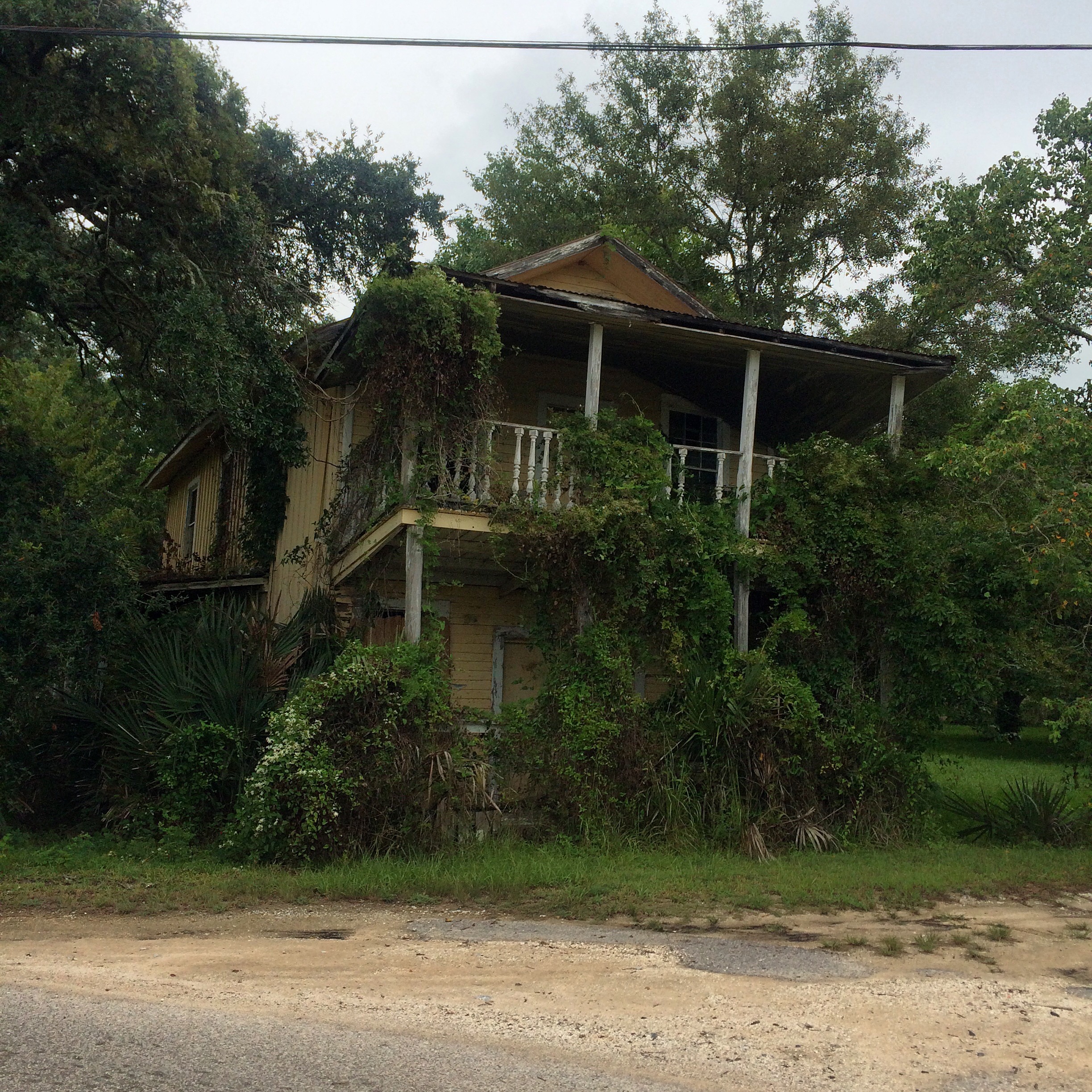
The Yellow House

This next picture was a house around the Coden Belt road that, back in the 80s and early 90s, was (per my mother) a boarding house where all the known homosexuals in town lived. The landlord was another one of the Schambeau family. I assume the house reached this state of disrepair from Hurricane Katrina. According to my mother, this photo is of the wrong house, the correct one is the other (also yellow) house next door.

IMG_7851.JPG

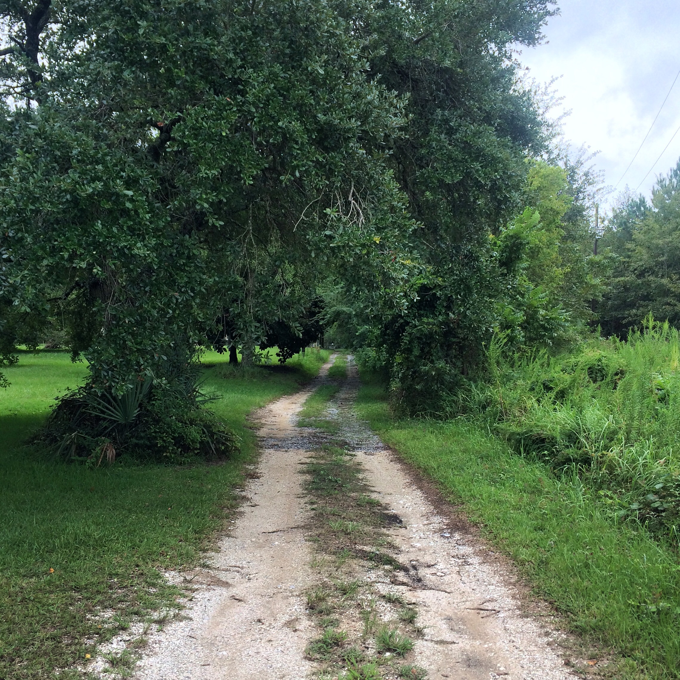
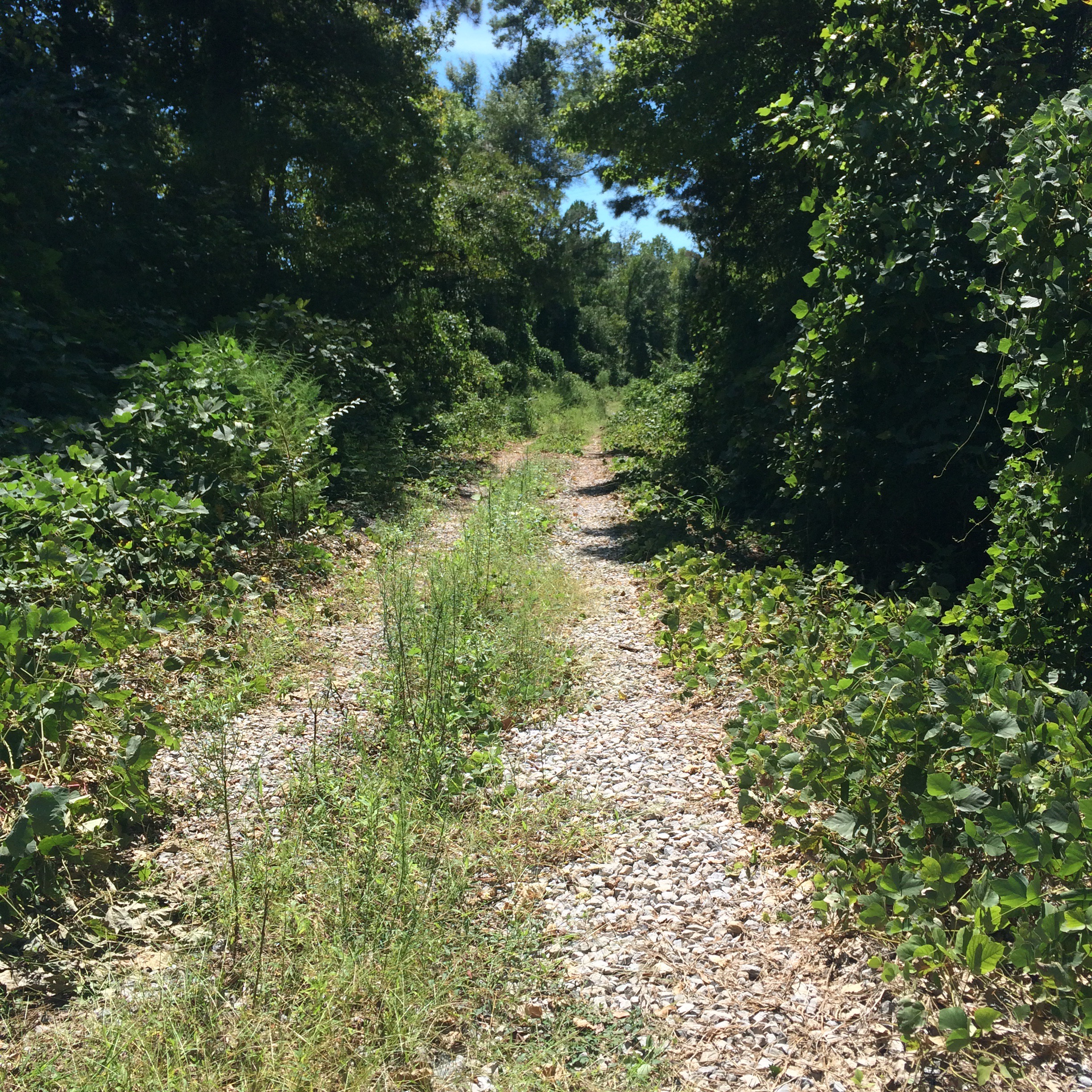
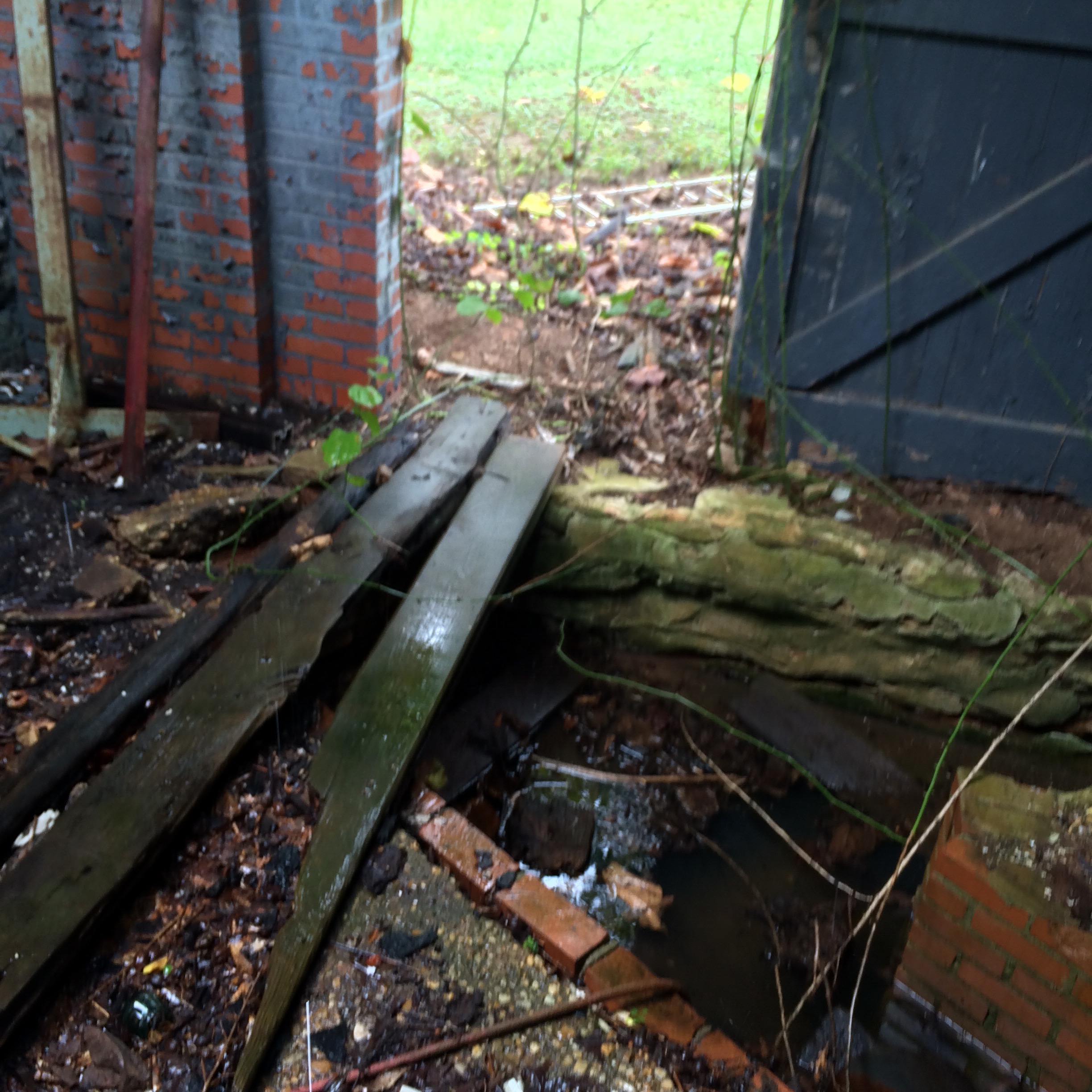
This is what the dirt lane beside that house looks like:
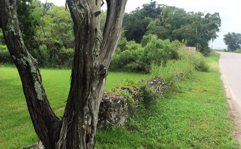
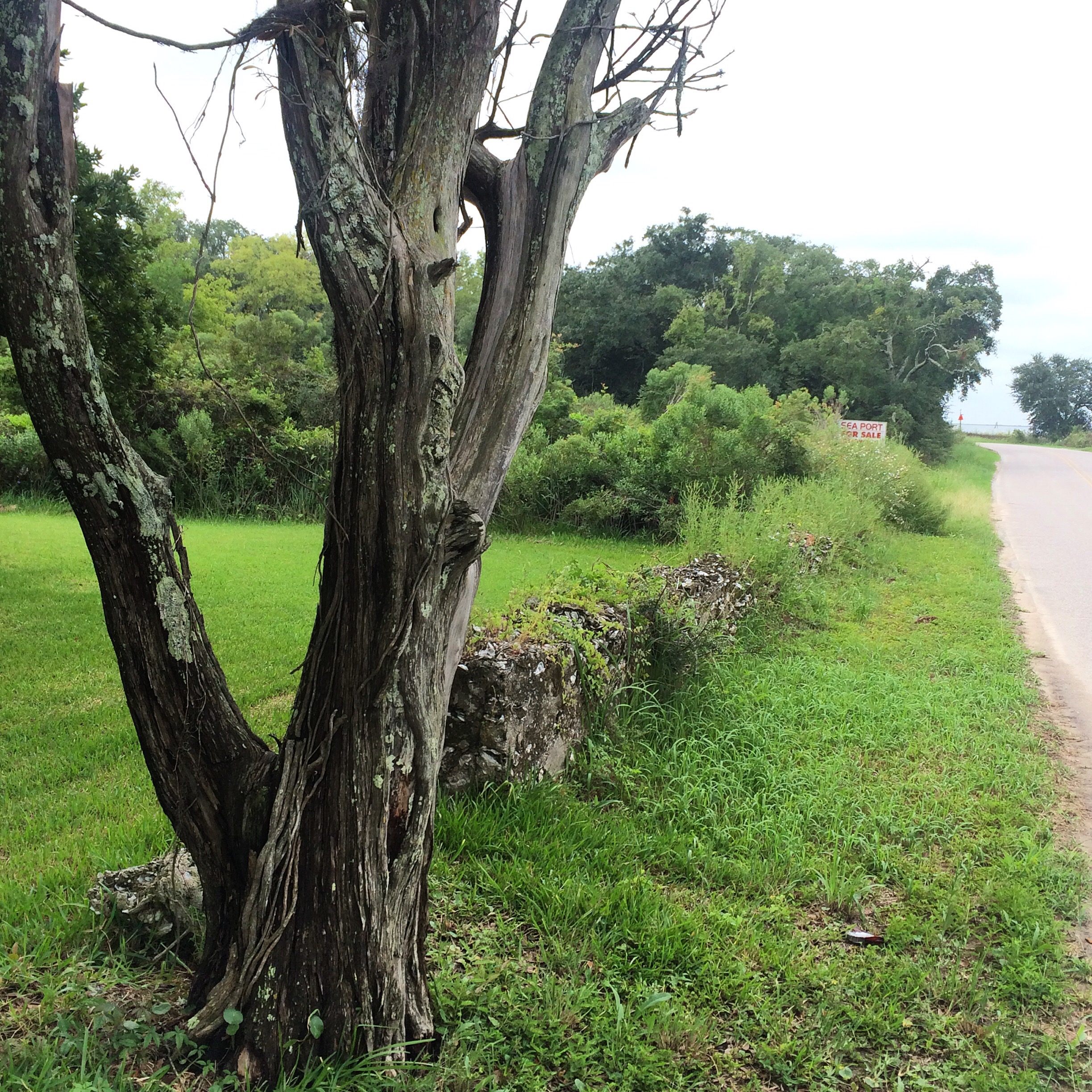
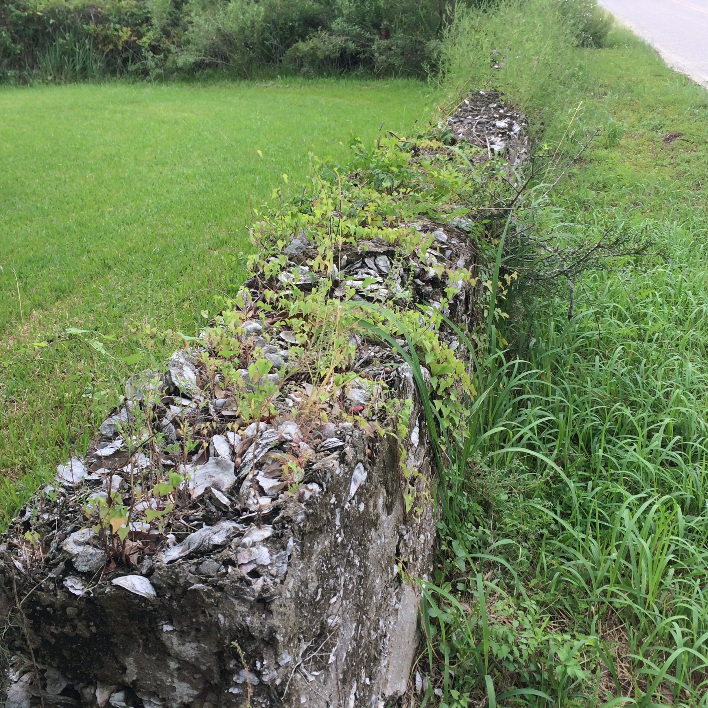
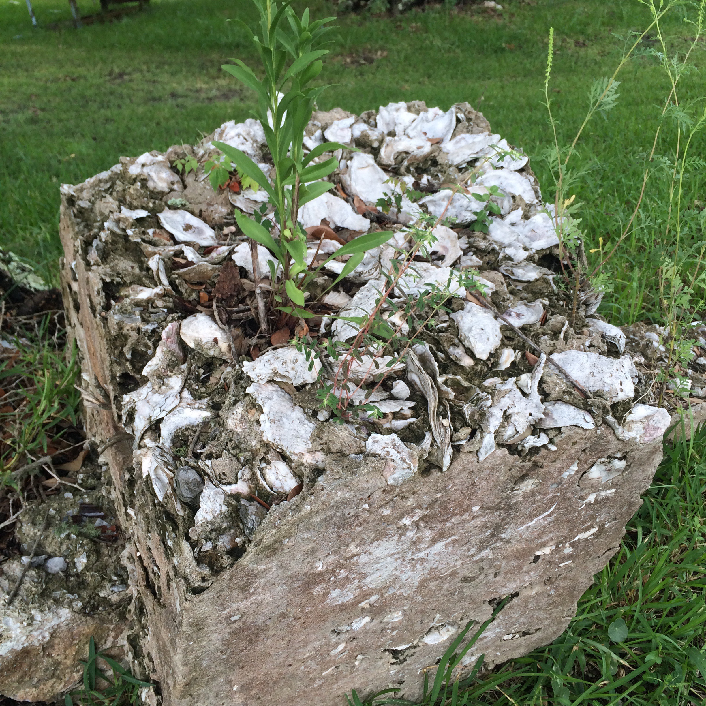
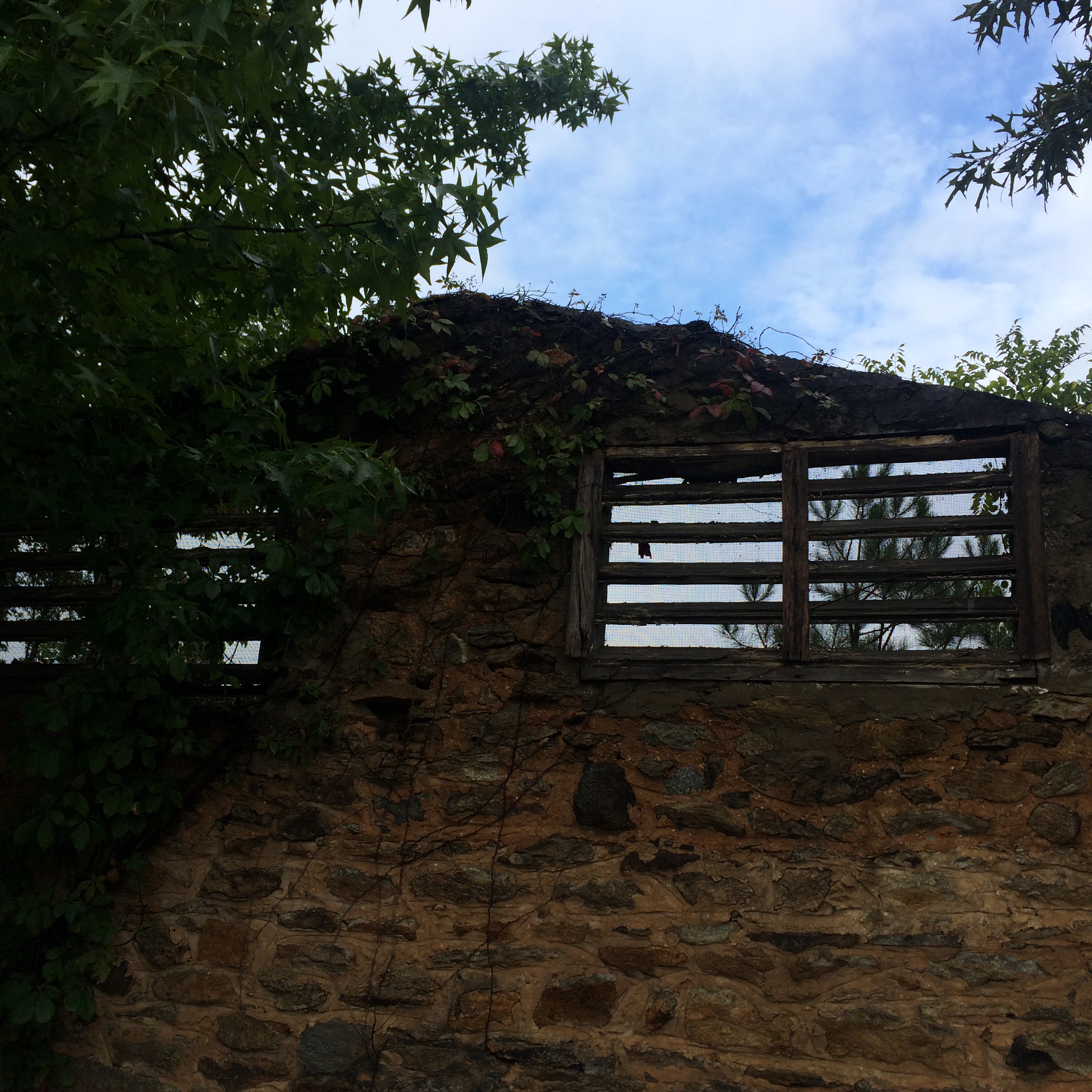
IMG_7852.JPG

The Shell Fence

Just down the road a piece is the place with the oyster shell fence. This was, I am told, once a common local building material – there was once a “shell house” in town made entirely of it.
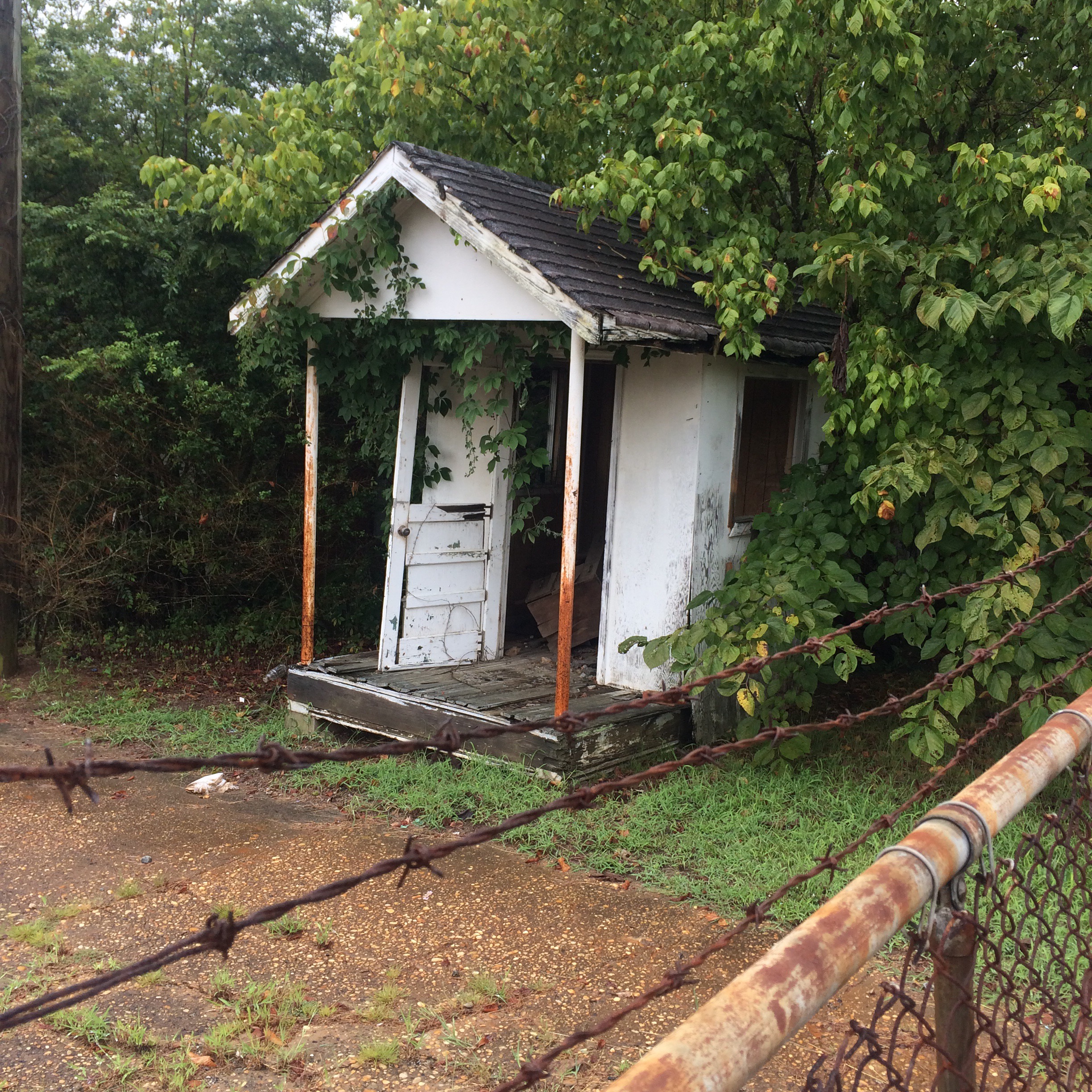
IMG_7850.JPG

IMG_7805.JPG

IMG_7809.JPG

Coden Drive-In

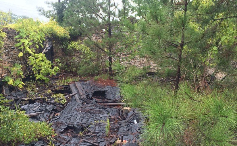
The “Coden Drive-In”. You need to understand that “Coden” is pronounced something like “Code-Inn”, so the name of this place rhymed. The building got like this from Katrina but I don’t remember if it was in business right up until then or not.
IMG_7848.JPG

There wasn’t much to do in Bayou La Batre and Coden back in the late 70s and early 80s, so my family’s idea of a fun evening when I was about 5 years old was to come to this place and get ice cream cones, and then go driving around watching the sun set on the bay while we ate them.
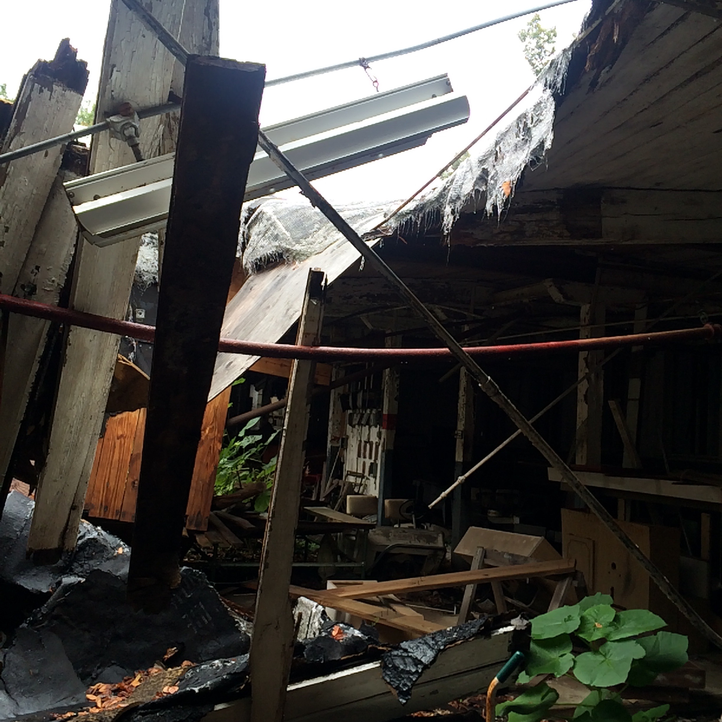
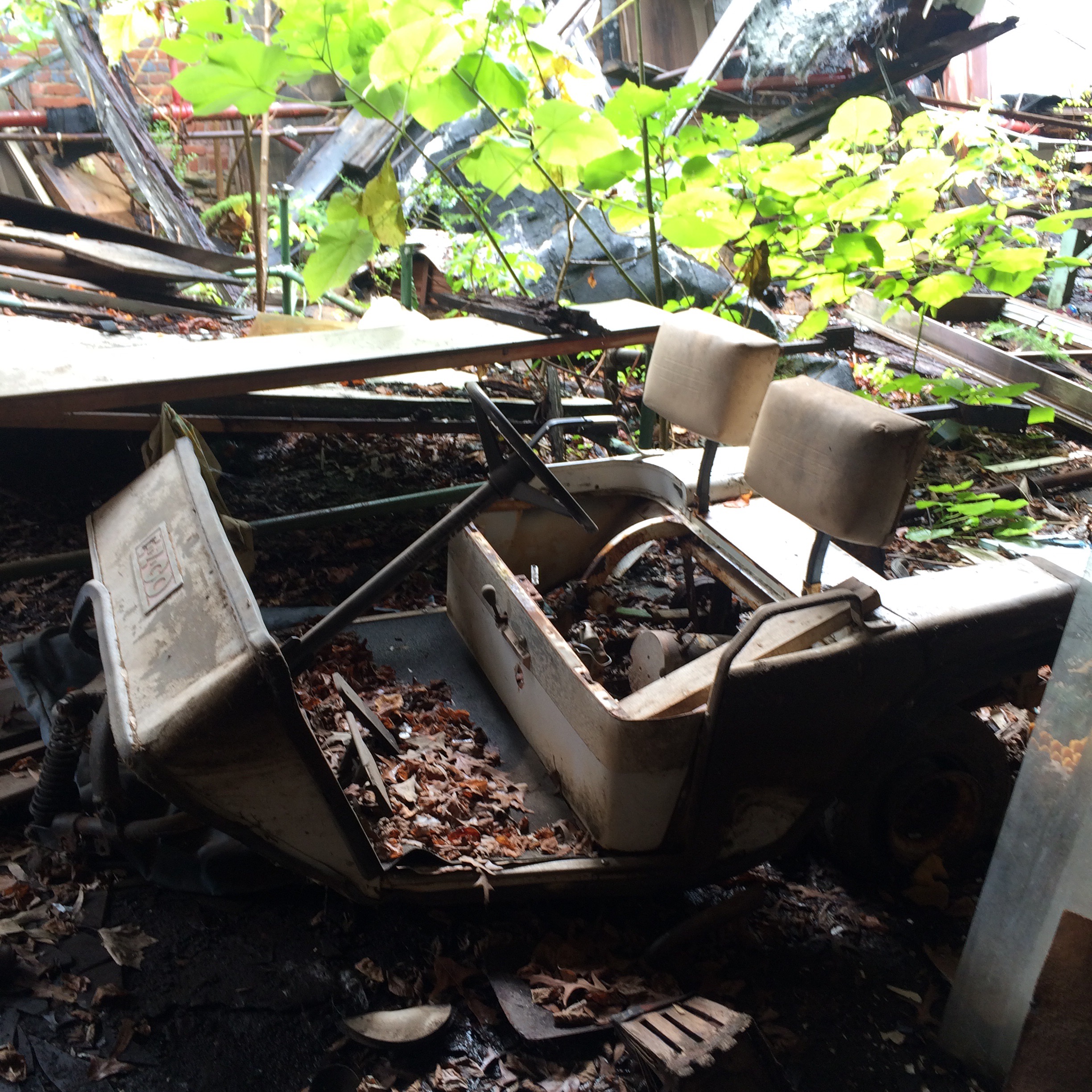
The Catalina

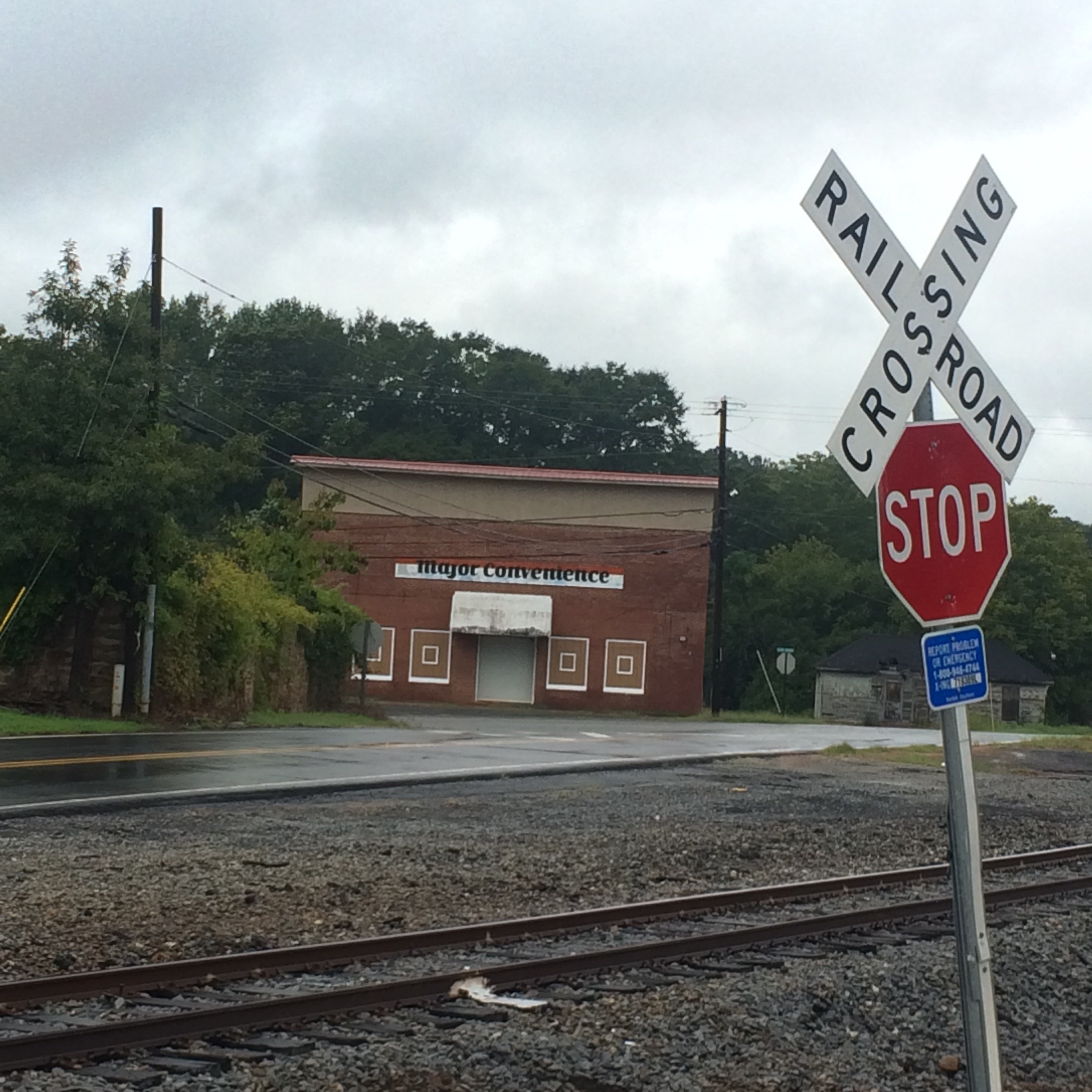
The ruins of the old location of the Catalina seafood restaurant, which everybody called “Ory’s”. The restaurant was closed for years after the hurricane but now is open in the old Schambeau’s building:
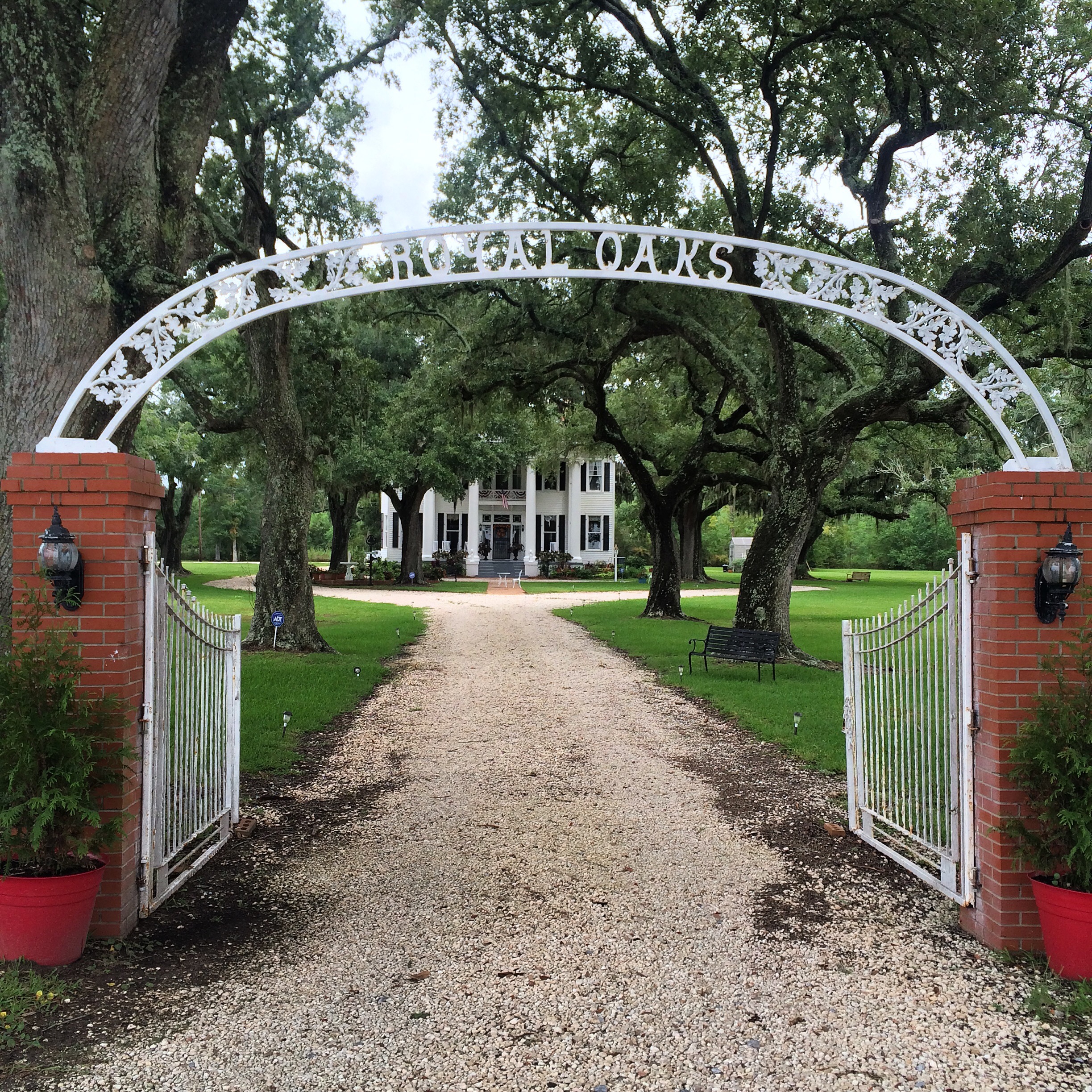
IMG_7817.JPG

Royal Oaks

“Royal Oaks” is one of the few remaining homes from Coden’s days as a seaside resort in the l890s. This period of prosperity was ended by disastrous hurricanes in 1906 and 1916. They had no names then, just “the 1906 storm”.

IMG_7849.JPG

Peter F. Alba School

And now, Alba. The school where I spent the blerst of my childhood. Now only a middle school, in my days Alba served  kindergarten through 12th grade.

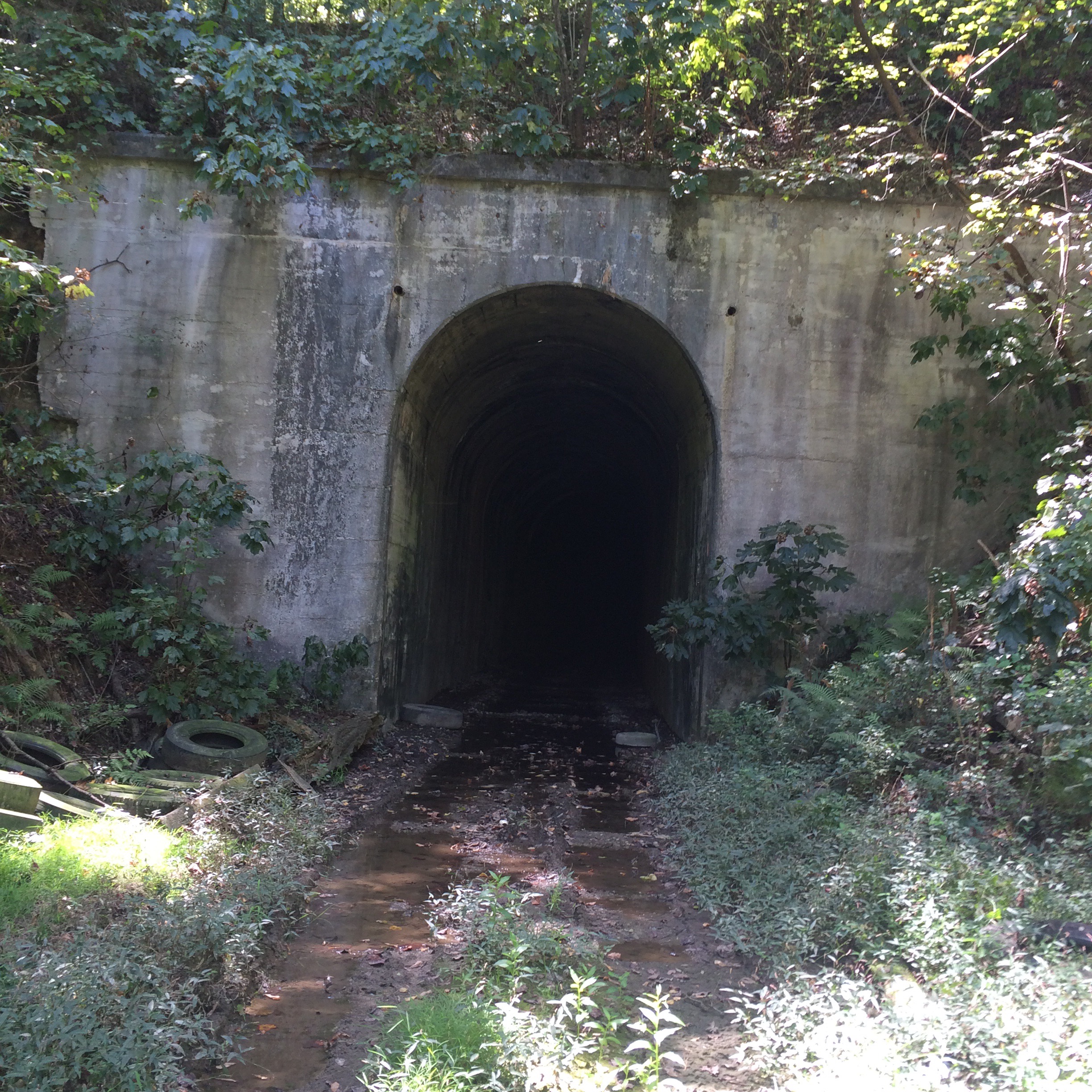
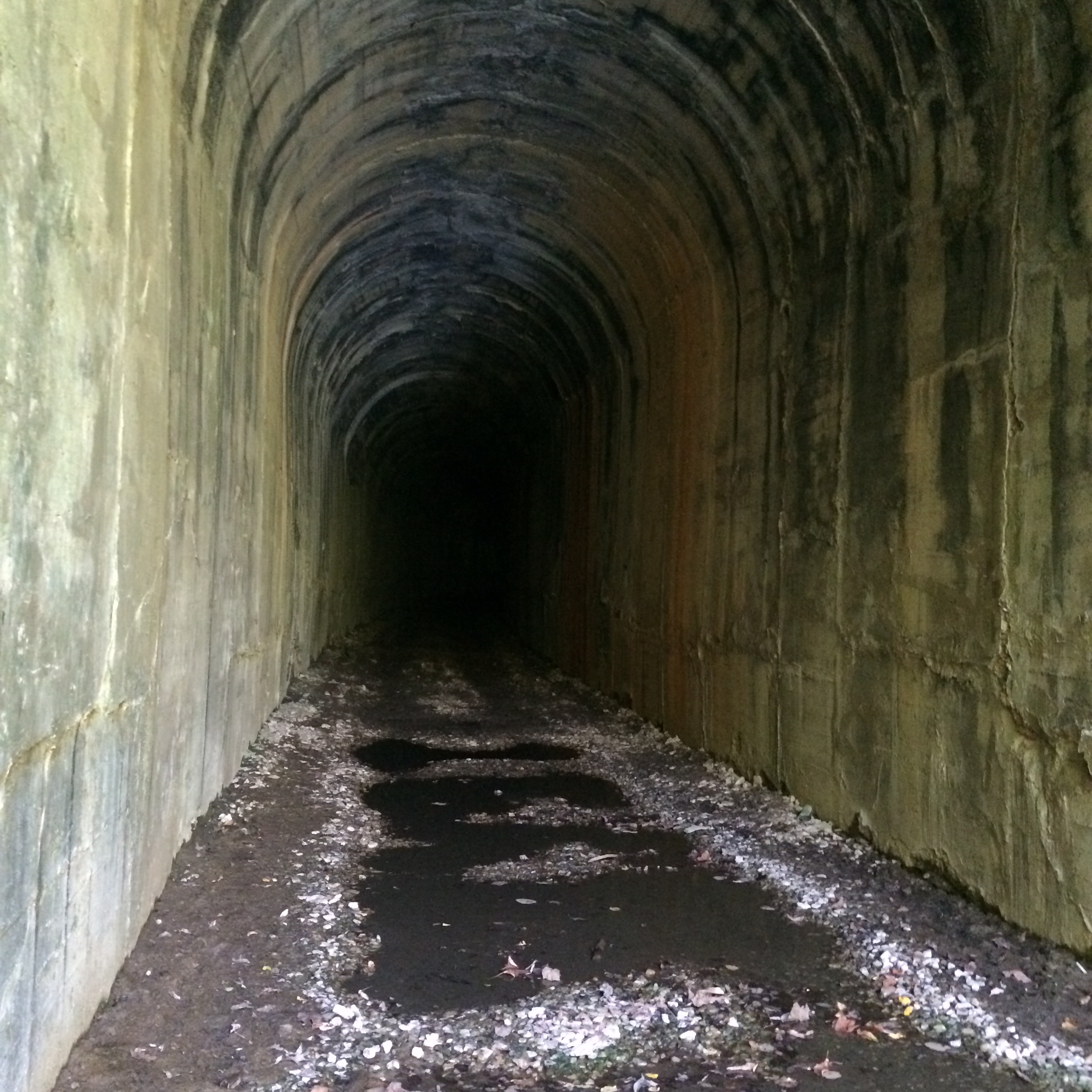
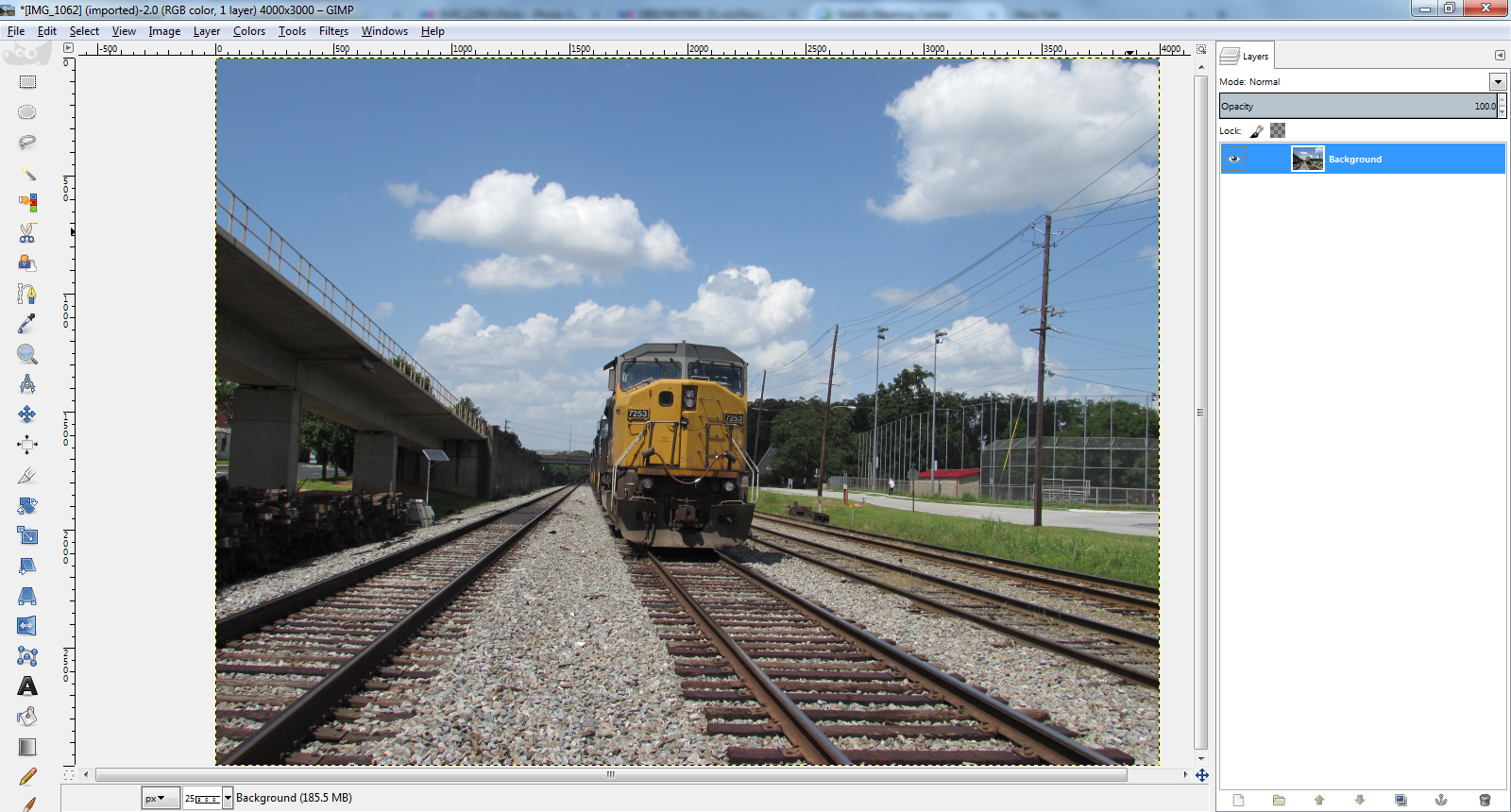
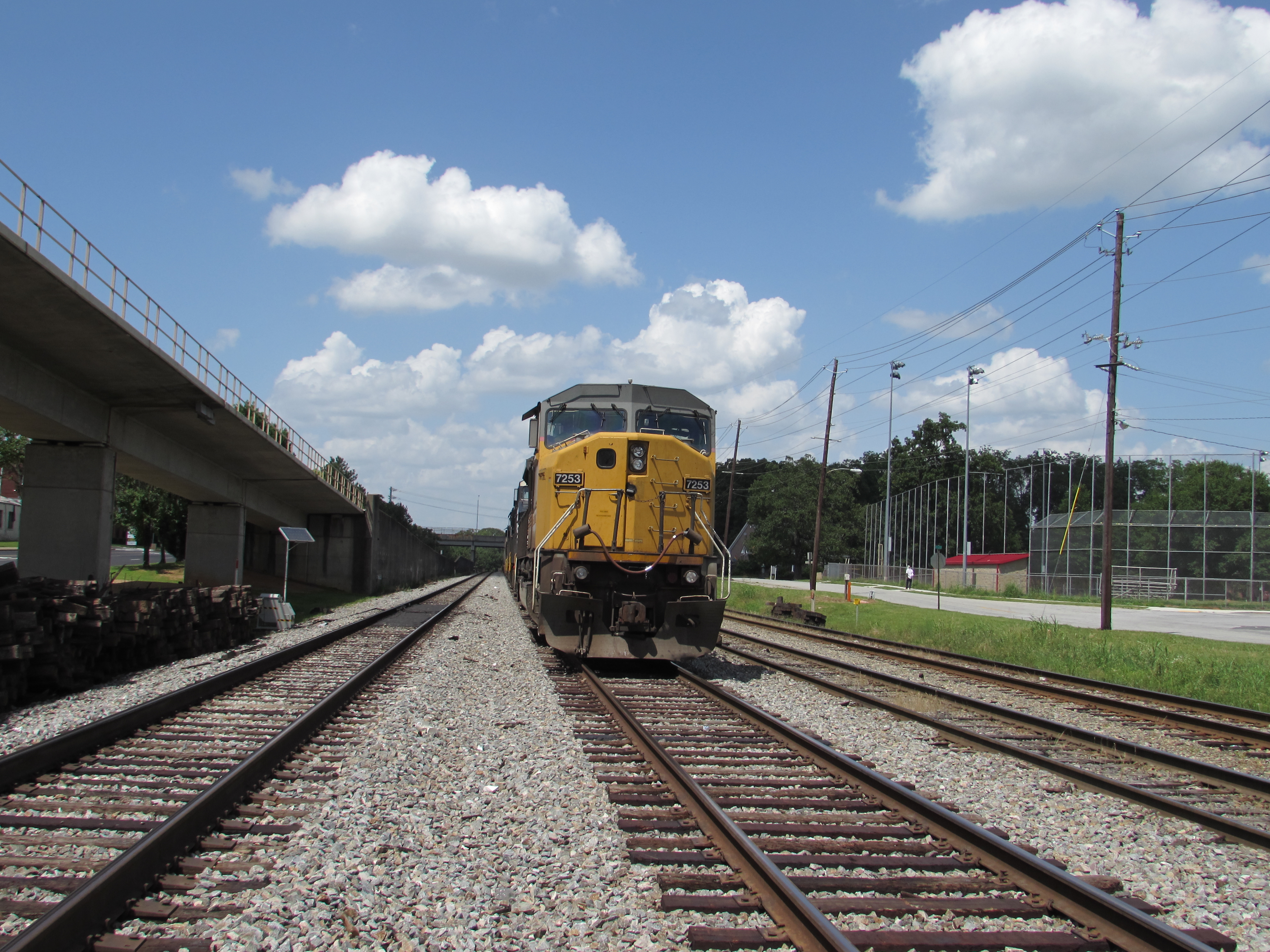
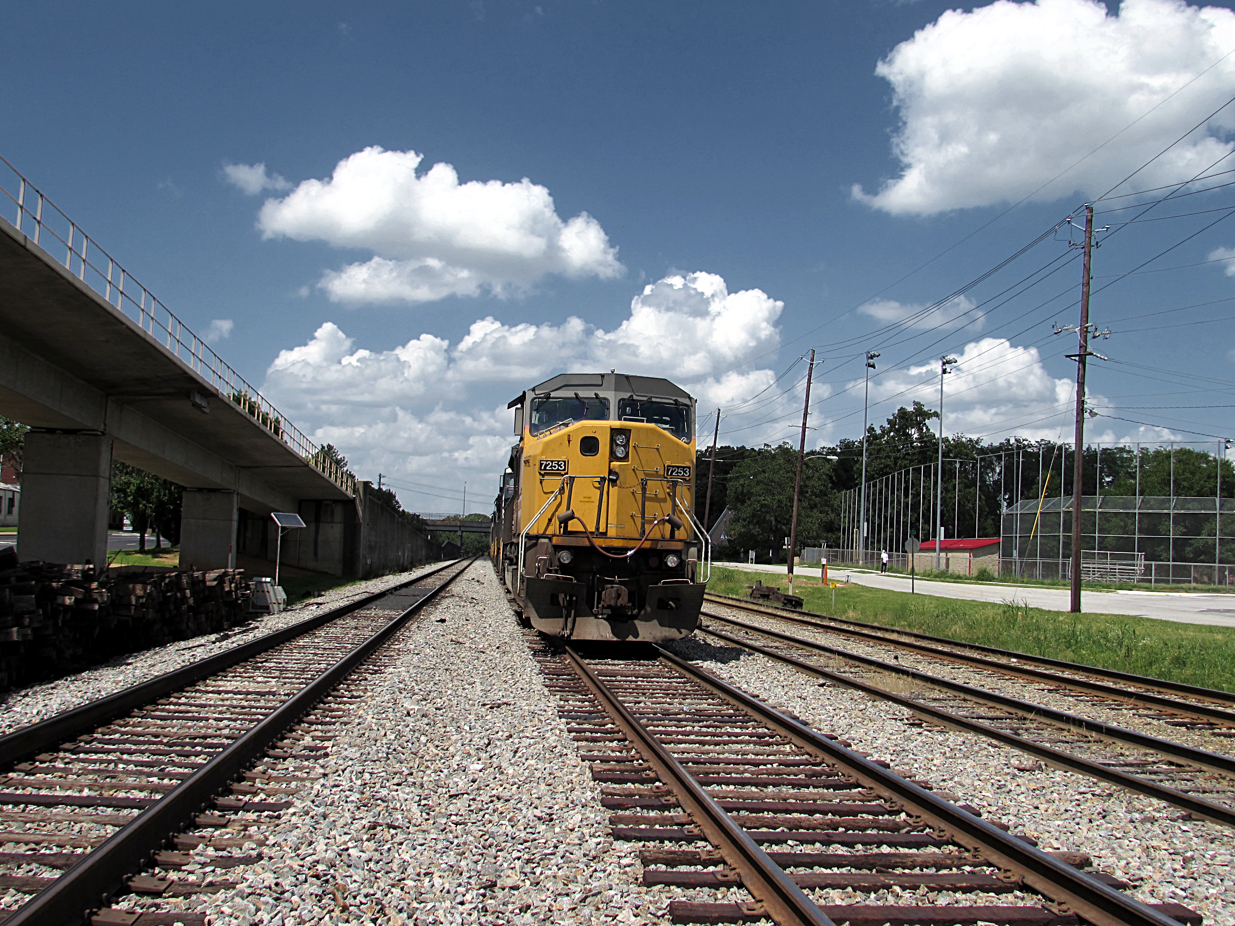
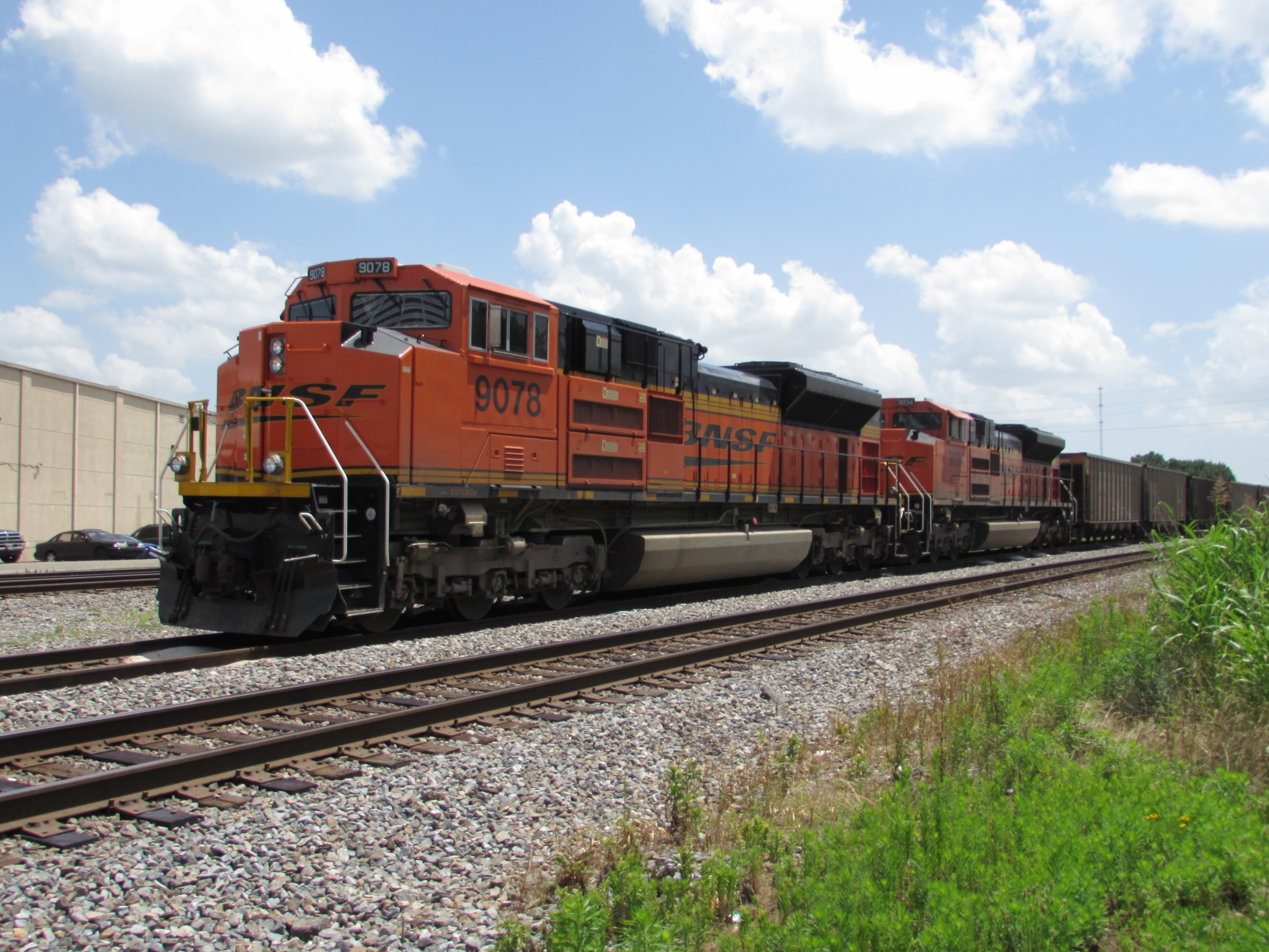
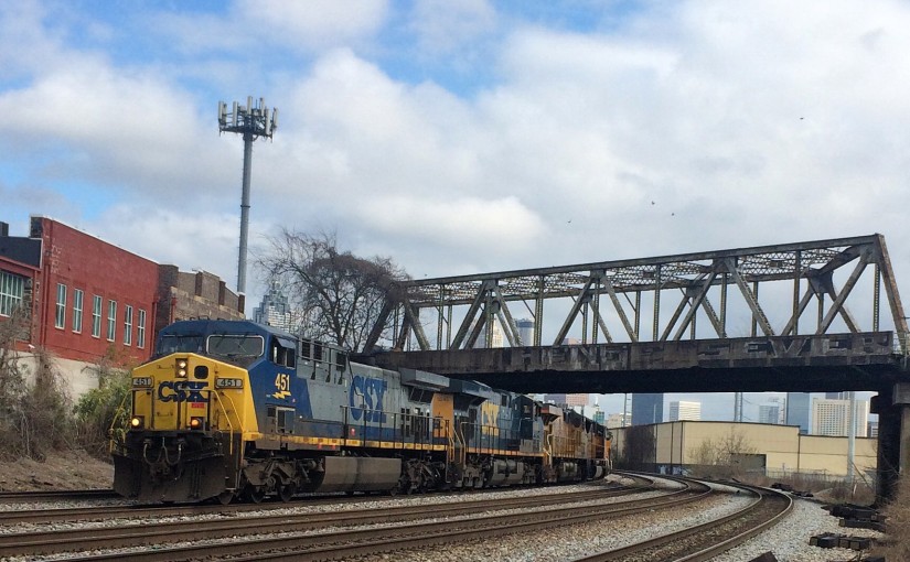
This caboose was installed when I was in high school. No predecessor of CSX ever ran to Bayou La Batre. (The only railroad in town, long since gone, was the Mobile and Bay Shore, a Mobile and Ohio subsidiary. If it had not been abandoned or sold, it would be part of Canadian National now.)

IMG_7847.JPG

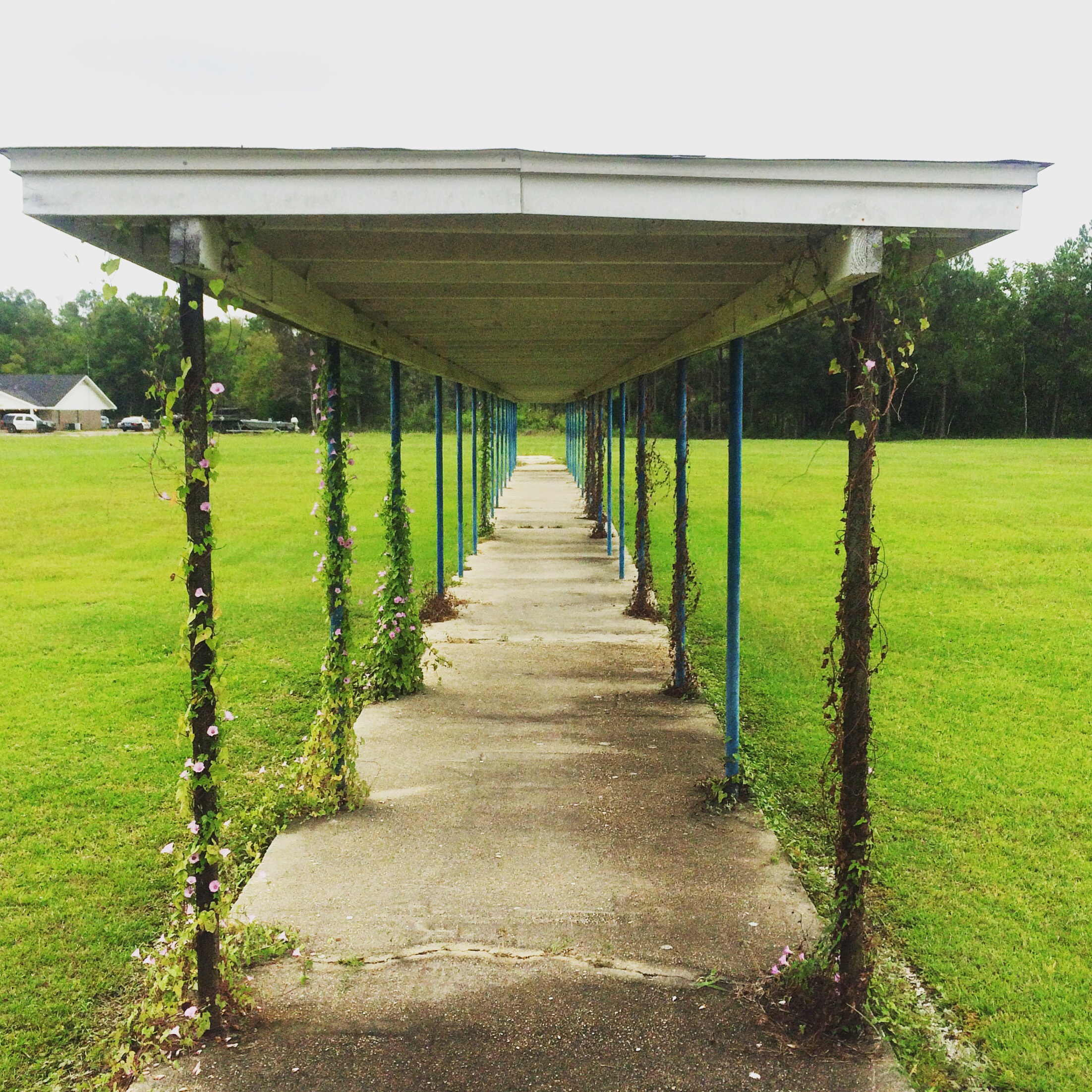
All of Alba’s “portables” – that was what they called a classroom trailer back then, a “portable” classroom – are gone. I don’t know if the hurricane got them, or if the school wasn’t crowded enough to need them anymore after the new schools opened and took most of the students. Now this was once a covered walkway that kept students out of the rain on our way to class, now it is just sitting in the middle of nowhere.

IMG_7840.JPG

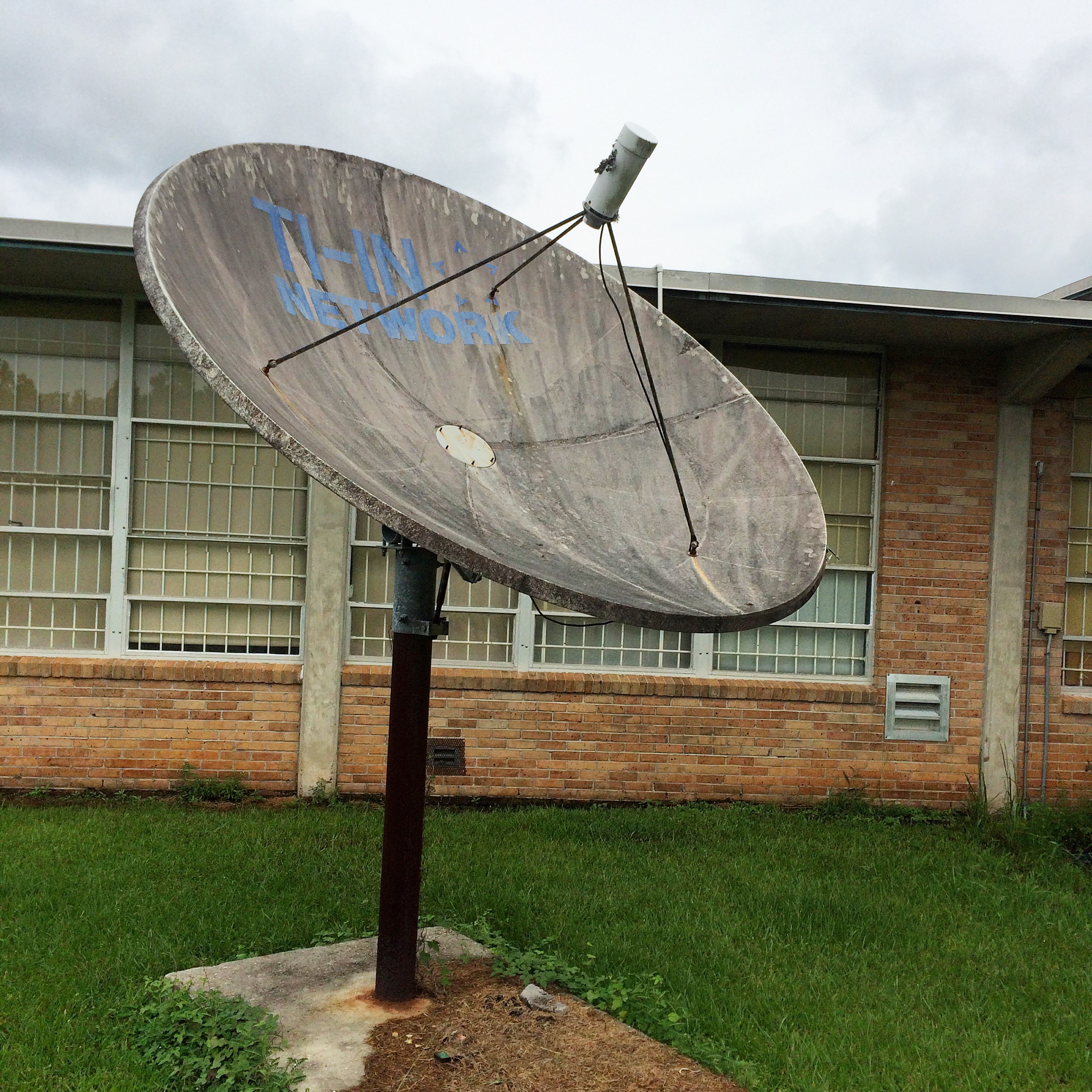
This was the satellite dish that we used to receive “Channel One” broadcoasts in the 90s:

IMG_7846.JPG

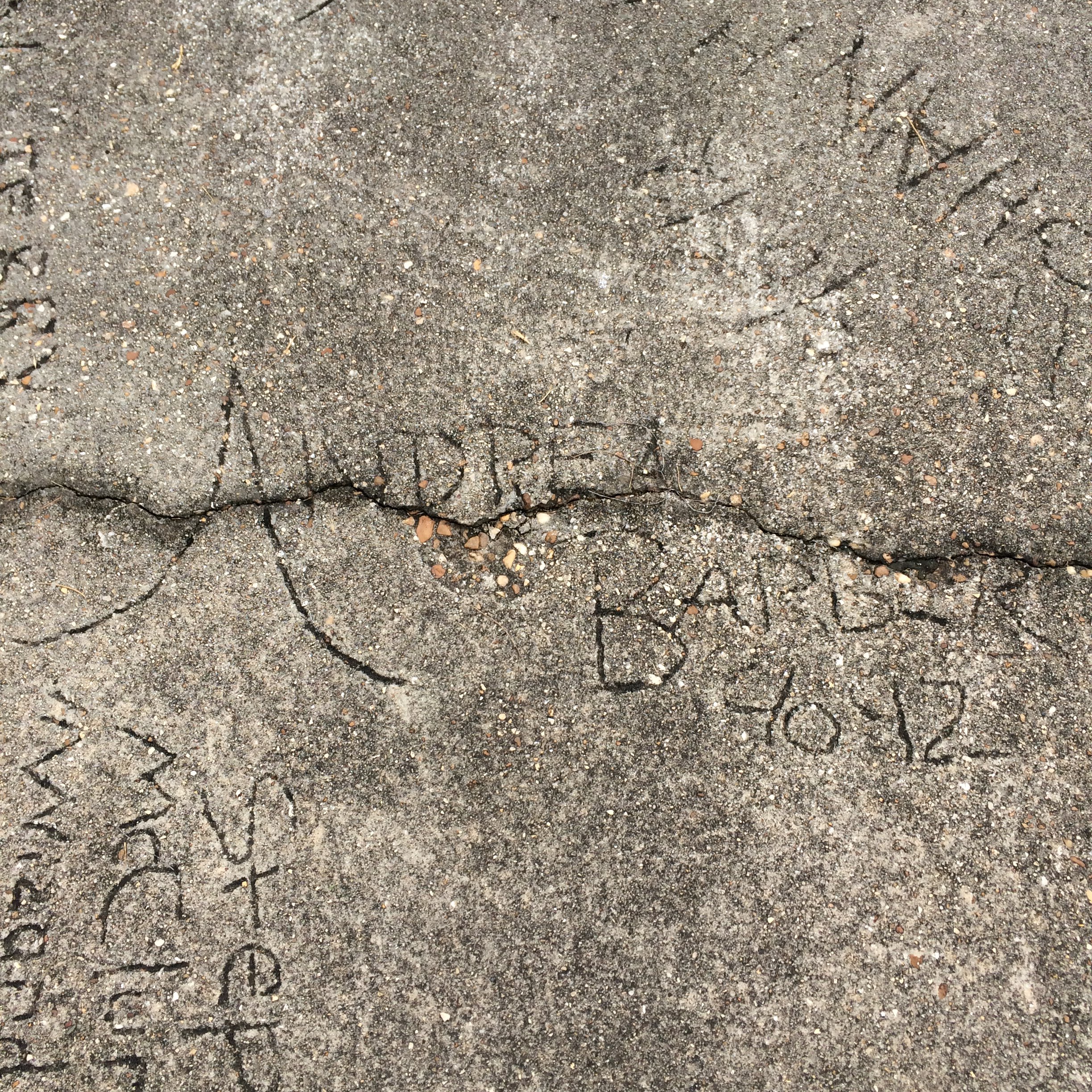
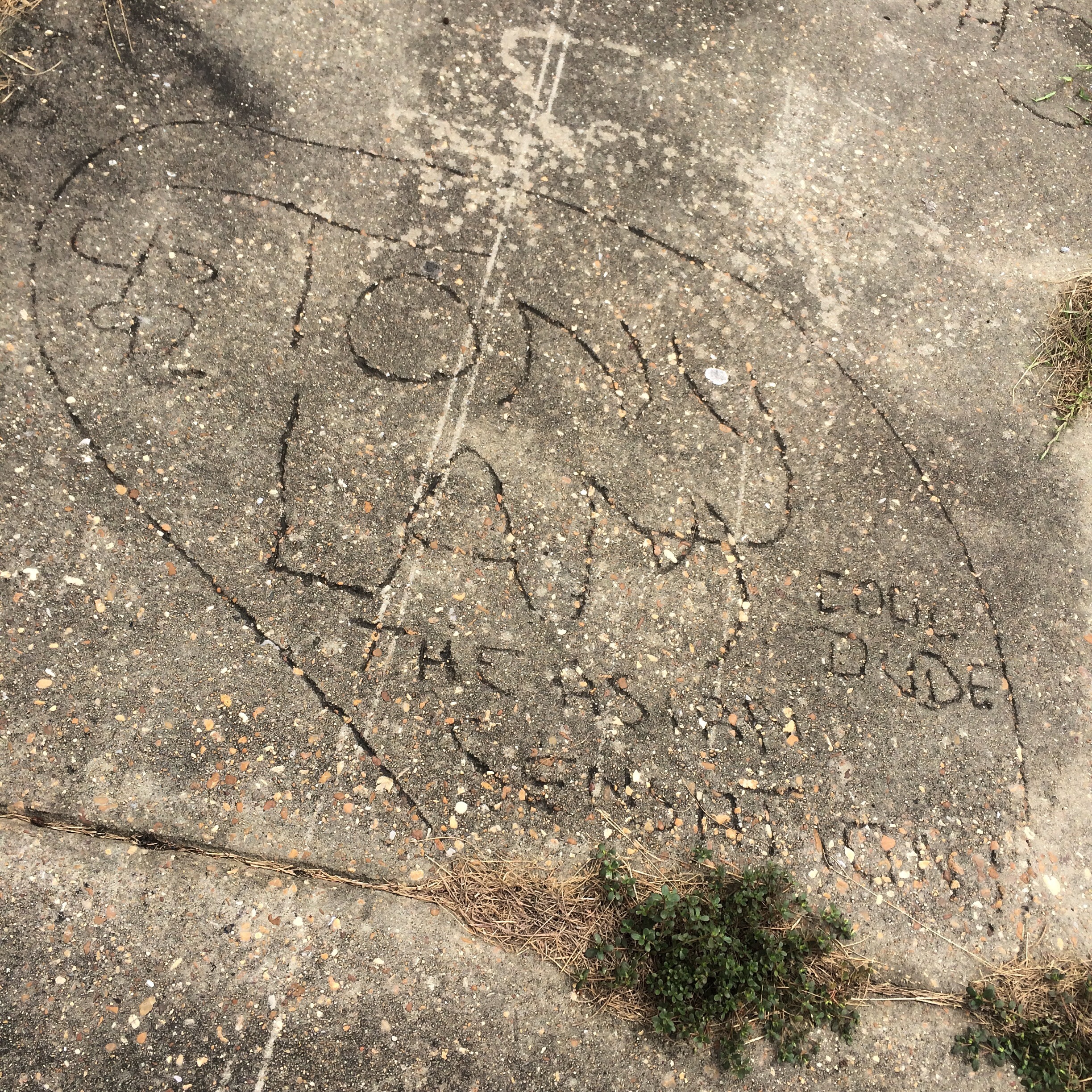
And now, the Walk of Fame of 1991. That year, the school put in a new sidewalk and allowed students to sign it. I looked and looked for my own name, but could not find it. I know almost all of the names as people I went to school with though.

IMG_7827.JPG

IMG_7830.JPG

IMG_7842.JPG

IMG_7844.JPG

IMG_7845.JPG

IMG_7843.JPG

Tunnel Springs, Alabama

Near the town of Tunnel Springs in southwest Alabama is a feature normally reserved for more mountainous areas: a railroad tunnel, abandoned for years, and relatively easy to find.

The tunnel is located up the abandoned line past the north end of what is now the Alabama Railroad. Wikipedia gives us the date of construction of the tunnel as 1899:

The route of the Alabama Railroad was originally constructed over several years (between 1880–1901) as the Pensacola & Selma Railroad and quickly became a part of the Louisville & Nashville Railroad network. The original line proceeded north from Corduroy, Alabama to Selma, Alabama. That portion of the line was abandoned by the Seaboard System prior to the merger with CSX in 1986. There was also a L&N branch that went to Camden from a junction just northeast of Corduroy that was abandoned prior to the merger into the Seaboard System in 1986. The remainder of the line north of Peterman, Alabama was abandoned approximately 1994 to include an 800+ foot tunnel built in 1899 located at Tunnel Springs, Alabama.

This should not be confused with the similarly-named and situated Alabama and Gulf Coast Railway, the former Frisco line only a few miles to the west.

As I’m always looking for things to do on that long stretch of Nowhere, Al, between Mobile and Montgomery, I decided to go find it. After looking at some topo maps, I got a pretty good idea of where it was.

This link in Google Maps gets you to a location where a trail that used to be the tracks crosses the road:

https://www.google.com/maps/place/31%C2%B040’19.7%22N+87%C2%B013’21.4%22W/@31.672144,-87.222623,18z/data=!4m2!3m1!1s0x0:0x0

From there, I walked south along the railroad. There were no ties or rails left on this part of the railroad, making a smooth walk.

IMG_7867.JPG

Obviously by the ruts in the ground, people drive off-road here a lot, so if you have a 4×4 you could just drive right to the tunnel.

Getting close to the tunnel:

IMG_7869.JPG

Nearing the tunnel entrance, the trail gets pretty muddy. You have been warned.

IMG_7872.JPG

This picture, you can kind of see how much water is right in front of the tunnel.

IMG_7874.JPG

It’s actually drier inside the tunnel itself.


IMG_7876.JPG

I walked far enough to see daylight from the other end, and then turned around.

The ceiling is home to a large number of bats. The sound of them chirping is quite loud, and the whole place smells like guano.


Sargent, Georgia

“Never go in there again!” – a longtime Newnan resident after being shown these pictures and recognizing the location.

 This old place looks to be some kind of workshop. I did not mess around it other than peek in the window.  

I’m guessing this was a pump house.  Looks about the size of the pump house at my Nana’s old place anyway.  

All this stuff is right by the NS railroad but I didn’t see any trains.


This structure whatever it was, has no roof is just stone walls now.


And then there’s this place. An old guard house I guess.
  

And this is what it was “guarding”. A partially collapsed warehouse full of random shit. 


I shined the light from my phone into this door but it still was too dark to see anything beyond it.


GIMPsplorations, part 3

Continued from yesterday.

Let’s take another look at what we’ve been doing here. Because the “value” of a layer is a single number, you don’t actually have to make the layer gray-scale in order to use it like we have been doing.

As before, I duplicate the layer, and this time I  set the top layer’s mode to “value” without using any channel mixer first.

1

Now, initially it is not having any effect on the layer below it, since it is an identical copy it has the same value for all pixels.

Now we are going to use Levels to get us back to where we were with the channel mixer, only because Levels previews the changes in real time, we will be able to see what the overall effect will be while we are monkeying with the sliders.

Choose the Blue channel and drag the output slider halfway down. Notice the sky gets darker. This is because blue is not contributing less to the channel’s overall value.

2

Go on and drag it all the way down to zero, completely suppressing any contribution that blue might have been making to the value.

By the way, at this point if we view our top later as “normal” it looks like this:

3b

The actual layer has red and green but no blue, giving it a yellow hue. But the fact that only its value is affecting the layer below it means we never see this yellow. But I digress.

Notice anything odd about what happened to the blended layers when we went from halfway to no blue at all?

3

What didn’t happen? The sky didn’t get any darker. It was already as dark with the slider halfway, as it was ever going to get.

Now think about how “value” is calculated. Value is the maximum of R, G, and B. So it a pixel has R=255, G=128, and B=80, it’s Value is 255. The smaller numbers play no role.

So what happened to the sky is, as soon as we had turned down the blue enough that it was no longer the largest of the three numbers, it no longer made any contribution to the value, it became irrelevant. The value of those pixels that used to be mostly blue is now determined solely by their red and green channel, even if there is still almost as much blue left.

If we then go mess with the green, we see the same thing, we only have to turn it down about 1/4 of the way before it stops contributing to the value.

4

This is just inherently how the HSV color space works. HSV was invented in the 1970s and intended to be used on the primitive computer hardware of the era, so the calculations to convert between it and RGB had to be as simple as possible.

It is, as noted last time, precisely this property that allows those pink faces in the picture to remain more or less as-is. The brightest channel for all of those pixels is already red in the original image, so their green and blue make no contribution to the value, and therefore those pixels do not change value when the overall amount of green and blue is reduced. That effect actually seems kind of beneficial when deal with people.

But what if we don’t like the limited amount of effect that our adjustments have? There are other ways of measuring the brightness of a pixel which take more than one RGB channel into account. Examples would be Lightness and Luminosity.

But GIMP does not give us layer blend modes for Lightness or Luminosity, only Value, so that trick isn’t going to cut it.

There are other modes that can allow a layer to affect the brightness of the layer below it, but we won’t be able to play our little slider games. If we try it with a color layer on top, the hue will be affected.. in the particular extreme case of turning down everything but the red channel, we’ll end up making our final blend be all red. We’ll have to convert to gray to start with, like in the original installment.

(If only GIMP supported non-destructive effects, this would all be moot)

So first start over with an exact duplicate of the base layer, and use the channel mixer to get a monochrome image of 100% red, 0% green, 0% blue.

5

The first one I want to point out is Darken Only. The way this works is, it compares the all three channels of both layers, and chooses the darker of the two values every time. What this means is, areas that are dark in the monochrome layer, like the sky, and up monochrome in the final blend while areas that were bright like the faces in the monochrome end up using the color of the orignial.

That is, the sky is completely desaturated as well as darkened, the trees partially so, and subjects mostly untouched! That’s kinda neat, I guess.

6

Now lets look at Multiply. As the name implies, this multplies the values of the two layers, scaled down so that brightness can not blow out the highlights. This darkens everything, but especially the blue and green areas, and also mutes the colors but not as drastically as Darken Only.

7

You can mess with levels and curves to try to re-brighten it, but the more you do so you will be undoing the darkening of the sky as well.

Overlay is normally supposed to darken an image, but in this case it actually makes it a lot brighter in the areas that have a lot of red. I don’t really feel like trying to understand why.

8

There are a lot of other modes but they are all really ugly and are left as an exercise for the reader.

Now, we still have at least one more trick up our sleeve. We can use the decompose/recompose workflow to substitute this red channel in for one of the various types of “brightness” channels that exist several of the color models other than RGB.

So, turn off the visibility of the monochrome layer and select the base, original colored layer, and go Colors->Components->Decompose. Look at all those color models to choose from.

9

Obviously skip RGB and RGBA, we already used channel mixer to accomplish anything we could use that for. Also skip HSV since it is equivalent to what we were doing in the first place.

Let’s try HSL (Hue, Saturation, Lightness), another 1970s era color model for crappy hardware with simple math.

This creates a new image with layers for each of Hue, Saturation, and Lightness. Hide the first two and look at the Lightness channel. It is a greyscale representation of the original image.

10

Now, what I’m going to do is copy the layer that we originally made using channel mixer, and paste it onto the Lightness layer of the decomposition, completely replacing the contents. I’m going to assume you know how to copy and paste layers in GIMP.

The difference is subtle in the monochrome, but the pasted contents are slightly more “contrasty” than what was there before.

11

Now, go to Colors->Components->Recompose, to reassemble these layers back into a color layer. GIMP remembers which layer they were extracted from and puts the new image back on the same layer in the original image.

The result, the contrast has been boosted without affecting the saturation like some of the other approaches (that is, the sky is a deeper blue not a dull blue-gray). It is certainly a less dramatic effect that some of the other stuff we’ve been doing though.

12

Other color models choices should have varying degrees of difference. I don’t feel like looking at them all.

LAB ends up darkening things quite a bit, almost but not quite as much as the Multiply mode did:

13

CMYK with our monochrome image pasted over the blacK channel and inverted ends up being exactly the same as the Value mode we started with.  I guess that means that the K channel is really just the inverse of the V channel from HSV. Huh.

That’s probably about as much as I feel like messing with this for right now.


GIMPsplorations, part 2

Remember last time, I said that I wasn’t sure what would happen if I tried that particular layering process on a portrait. Well, I tried it, and I was pretty surprised by the result at first, and then realized it wasn’t so surprising after all.

Since the actual technique – create a black and white image of one channel, and then apply it as the value for all channels – was covered last time, I’ll skip the GIMP screenshots and jump straight to results. These examples also use the red channel, as before.
Mind you, I’m not claiming this is a great photo, but it has the advantage of being (a) my own work and (b) has a blue sky in the background.

Now see the before and after:

11313026_10152927912946375_1521003444913135714_oredvalued

Notice anything about the subjects? They hardly changed at all, compared to the background. It looks almost as if you separated the humans onto an isolated layer before you messed with the colors of the background layer.
If you are wondering what the blue and green channels do, they notably do not share the red channel’s property of preserving the faces unchanged. Here’s the green version:

greenvalued

This preserves the brightness of the foliage, and probably you could brighten it overall and get the faces back close to the original but the trees extra bright.

The blue, I don’t see much use for but here it is anyway:

bluevalued

Now, why is none of this surprising in hindsight? Because these subjects have more or less pink skin, and the tones of their mostly yellow hair is also captured by the red channel. Their clothing is of course monochrome, so its going to be the same on every channel.This can be seen using the Colors->Decompose tool. This is all three channels of a RGB decomposition and also the V channel of an HSV.

decomposed

Notice the red channel looks most like the V in the faces, the green looks more like it in the trees, and the blue has a similar (nearly white) sky. This is because the V(alue) channel in HSV is defined as the maximum of the R, G, and B values. No shit, Sherlock!

By the way, if the intention was to make a black and white version that looked good, I would probably not use any of the above as-is. The Desaturate tools’s Luminosity looks better than any of these, and I think 50/50 mix of the red and green channels (which is presumably close to panchromatic B&W film with a yellow filter) looks even better.

Now, the really interesting thing is, I’ve tried this on pictures of people with varying skin tones, and it does pretty much the same thing to everybody.

GIMPsplorations

I’ve been re-acquainting myself with some of the capabilities of the GIMP lately. This is something I’ve stumbled on.

So this is how the image looks to start with:

1

Duplicate the layer, because you are going to be doing stuff to it but still want the original:

2

Now in the top, duplicate later, use the channel mixer to make a monochrome image that is different from what you would get from the desaturate tool.  In this particular instance I like the red channel. The train is nice and bright and the background has unreal contrast between the clouds and the sky.

3

So now we have a black and white version, which is pretty nice in itself, but what else can we do with it?

4

Change the layer mode to “Value” and now the light/dark contrasts of the black and white version are being combined with the color information of the original. Now we have those crazy clouds in the color version!

5

It kind of darkened everything a little bit too much though, mess around with Levels to brighten it.

6

It may also be a bit too extreme in general, in which case adjusting the Opacity of the black and white layer will blend it with the original and split the difference.

8

Make a new layer “from visible” to apply further effects to the combined image, such as levels/curves/etc, unsharp mask, whatever else you want to do.


9

This can produce a somewhat surreal looking image, and I imagine it would look pretty jarring with human or animal subjects, but maybe that’s what you want.

Full size before (click to enlarge):

IMG_1062

After:

IMG_1062

Another one done in a similar way, this time just letting it be as dark as it wants to be. Realistic it ain’t, but it’s kinda neat.

IMG_1035

IMG_1035a

That cemetery on Old Alabama Road

This was probably a lonely rural crossing of two dirt roads when the few local residents started to bury their dead here. Now it is jammed into a weird triangular lot surrounded by busy streets on all three sides. You may have driven past it.

I wonder at what period of history was Old Alabama Road actually the main way to get to Alabama.

Rainey is one of the names seen frequently here.

IMG_0562

Notice above, James A. Rainey appears to have outlived his wife by nearly 50 years. Long enough for tombstone design fashions to change quite a bit. Its fun to notice stuff like this. Did Mr. Rainey ever remarry? He was a very young widower, and he lived a long time afterwards. If he did remarry, I bet his second wife and their children are buried here too.

This grave of “2 infant daus. of Mrs. & Mrs. Bud Rainey, 1909” is surrounded by a type of moss that wasn’t growing anywhere else.

IMG_0609

Another common name is Garmon.

IMG_0592

IMG_0578

Most of the graves appear to be cared for, but a few are in tall grass and one headstone had fallen over off its base.

IMG_0582

IMG_0587

Some no longer have markings of any kind.

IMG_0570

IMG_0577


IMG_0600

Lastly, I have no idea if this that looks like a rock set up in the ground is a  primitive headstone for a very old grave, or just.. a rock. I also have no idea why someone left this bag next to it. I’m not sure I want to know.

IMG_0605


The first arbitrary award for train-watcher friendly architecture 

..goes to Westside Provisions District.

When they redeveloped this property – which happens to span both sides of the NS Piedmont division right at Birmont Junction (the northeast corner of the Howell Wye area) – back in the 2000s they could have hidden the tracks away. They had all kinds of ways in which they could have fucked it up.

But instead they put a camera-friendly pedestrian bridge over the tracks right in the middle of their shopping center.

And on both sides of the bridge, the tenants are restaurants with patio areas facing the tracks.


GE’s dominance of the modern locomotive market

In my earlier post about the changes in railroads since I got into the railfan hobby, I noted the continued dominance of GE over EMD.

I decided the check the numbers. Using these two (very handy) Wikipedia pages:

http://en.wikipedia.org/wiki/List_of_GE_locomotives

http://en.wikipedia.org/wiki/List_of_GM-EMD_locomotives

Let’s compare just “modern” locomotives. Let’s define that to mean SD60 or newer for EMD, and Dash 8 or newer for GE. Note that this definition takes in the last thirty years. Let’s also limit it to six-axle locomotives, as 4-axle models are largely irrelevant in the modern marketplace. This also neatly rules out passenger locomotives, since all modern ones are B-B.

So, by that criteria, GE has sold 13,047 to EMD’s 5,811. That is a ratio of 2.2 to 1. So yes, GE has sold twice the engines that EMD has over the past 30 years.

If you limit to 1990s and newer models by throwing out the SD60s and Dash 8s, you get 11,250 to 4,664, a ratio of 2.4 to 1.

If you look only at models that are still in current production (according to these article), it is 4507 to 1047 or an astounding 4.3 to 1.

That is, GE’s lead established in the 1990s has increased over time.

Also notable, no single model designation by either builder in the past 30 years has come anywhere close to the SD40-2 at 3,982. But this is likely to be due to regulatory shenanigans. Had EPA Tier 2 regulations not kicked in in 2005, its hard to predict how many more C44-9W and AC4400CW would have been made. DC Dash 9 sales would probably have fallen off, but the AC could have broken the record easily. (The combined total of AC4400CW and ES44AC sales is 4,972)

Pictured: CSX 451 is an AC4400CW.

Atlanta Railfan Locations: Top o’ the Slide 

When I get to the bottom I go back to the top of the slide
Where I stop and I turn and I go for a ride

Till I get to the bottom and I see you again

The “top of the slide” is the CSX timetable name for the signal and control point at the south-eastern end of Tilford Yard. It is shortly west of “Howell Tower”. (Scare quotes because there is no actual tower there..)

I am not certain if “slide” refers to the Tilford Yard hump itself or to the corkscrew-ish loop that connects the main with the line that tunnels under it.

This location is clearly visible from the Marietta Boulevard bridge. NOTE: Marietta Boulvard is a separate from (but related to)  Marietta Road and Marieeta Street. Be aware this is a very busy bridge, and getting from one side of it to the other will put your jaywalking skills to a Frogger worthy test.

Your best bet for parking is probably on Huff Road. You might also find some on Marietta Street. There is no parking on the Marietta Blvd bridge itself.

The bridge also crosses the south-eastern extremity of NS Inman Yard. This is the northernmost bridge that crosses both railroads in a single span. 

You don’t see most of either yard from this bridge, especially not Tilford, so it should mainly be considered a location for seeing through trains as opposed to yard operations.

It is probably the best place from which to observe CSX trains going from Tilford to the Abbeville Sub and vice versa.

You will also be able to see, somewhat in the distance, trains coming into Tilford off the Manchester line. These trains tunnel under both NS and CSX.

The NS control points you can see from up on the bridge are Rockdale to the west and Howell Wye to the east. Rockdale is pretty much located on top of the tunnel.

CSX looking at the “top of the slide” signal:


CSX looking towards Howell Tower:


NS looking towards Inman Yard and the Rockdale signal. The train in the first photo is on the main line, the train in the second is on yard tracks.


NS looking toward Howell Wye:


A side view showing the CSX tunnel under the NS. This is taken from Marietta Road: